Auto-serial correlation, I see. A fascinating topic.
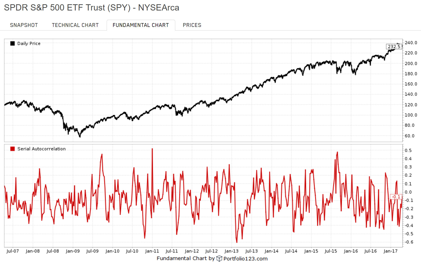
I wrote a formula to test the rolling 21-day serial auto-correlation of daily returns for the fundamental chart. I am not sure if I can share the chart directly, so here’s the formula:
(LoopSum("Ln(Close(CTR)/Close(CTR+1))Ln(Close(CTR+1)/Close(CTR+2))",21,0,1,0) - 21LoopAvg(“Ln(Close(CTR)/Close(CTR+1))”,21,0,1,0)LoopAvg(“Ln(Close(CTR+1)/Close(CTR+2))”,21,0,1,0) ) / (21LoopStdDev(“Ln(Close(CTR)/Close(CTR+1))”,21,0,1,0)*LoopStdDev(“Ln(Close(CTR+1)/Close(CTR+2))”,21,0,1,0))
It provides a normalized Pearson coefficient between -1 and 1 corresponding to how likely previous daily returns are indicative of current daily returns – on a rolling monthly basis. The squared-value (i.e., r-squared) could be used, I suppose, to indicate whether an observed 21-day trend is significant or just noise.
My suspicion with this is the same as Yuval’s:
A perhaps more surreptitious way I used to test the “illusion” theory was to make spreadsheets using randomly generated data (generated usually by Geometric Brownian Motion – a-la Weiner Process – or some comparable stochastic process). Then I would draw trends line using Excel’s charting features. Then someone would ask me what I was doing whereupon I would explain that I was using technical analysis to uncover the hidden patterns in charts. Usually someone would ask, “but can you make any money off of it?”. I would respond, “absolutely!” Often they would reply back, “cool! Can you show me how to do it?”. – “Of course!”, I would oblige.
About 5 or 10 minutes into it, I would break it to them that all the charts we had studied were randomly generated. All the patterns we had meticulously observed were purely figments of our own imagination trying to make sense of noise. So much for charts…
Or as my old friend Bill on the CBOT used to say, “Charts? I’ll tell ya’ about charts. All ships at the bottom of the ocean had charts on them. Some good it did them!”