I noticed this many years ago but forgot to report it.
To reproduce:
any live/simulated strategy / charts / interactive charts / since inception
Toggle log scale → displaying in log chart
Now, change the time horizon e.g. last 3Y or last 5Y, whatever
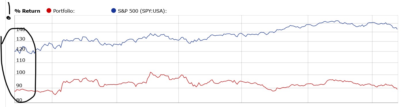
The blue and red curves start at completely different heights on the left. Ideally, the log chart would reset the starting point superposing red and blue curves e.g. 3Y ago or 5Y ago per the selected time horizon.
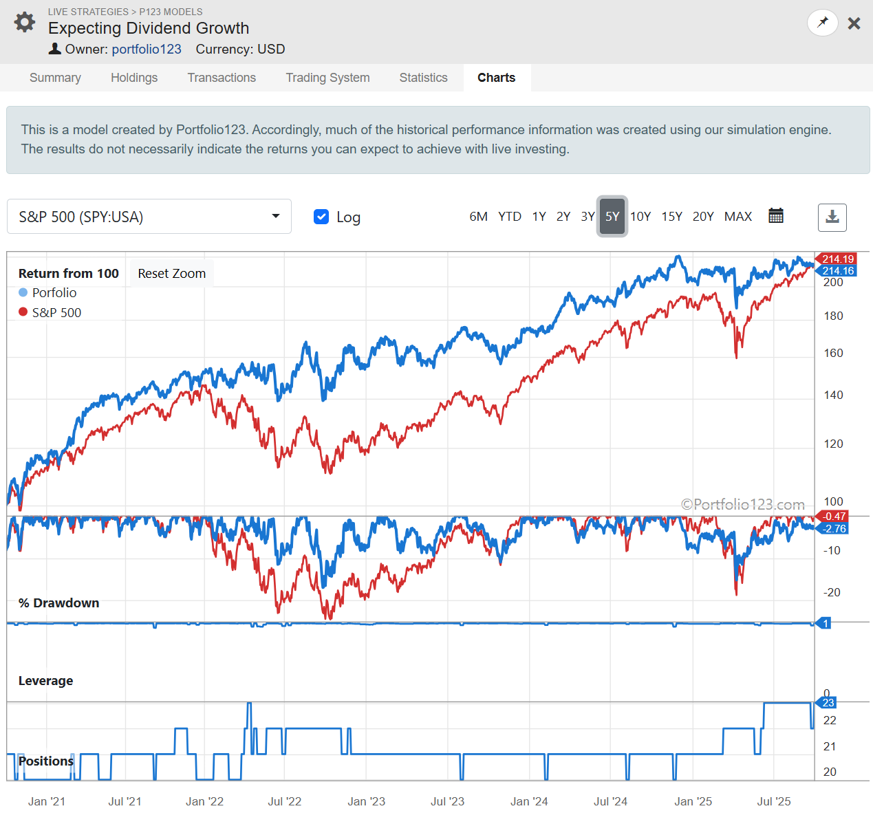
@jmh We released a new version of Strategy→Charts that addresses the log problem. Let us know.
Unfortunately couple of issues were released that were not caught during testing:
The colors are inconsistent (within research): red should be the strategy and blue the benchmark. Making colors consistent throughout the site is for a later task.
Both % drawdown lines must always start at zero for whatever period you shoose