From Stanford to Miami: Teaching Finance with Portfolio123 — My CAPM Test Study

Many top universities and MBA programs use Portfolio123 not only for teaching quantitative finance and portfolio management, but also for academic research, from testing factor models to exploring behavioral and market efficiency theories.

Some of the institutions that subscribe to Portfolio123 include:

  • Stanford
  • MIT
  • Harvard
  • Cornell
  • Miami University

My Experiment: Testing CAPM

I decided to test one of the very first finance models I learned back in school, the Capital Asset Pricing Model (CAPM) and see how it performs when tested with real data..

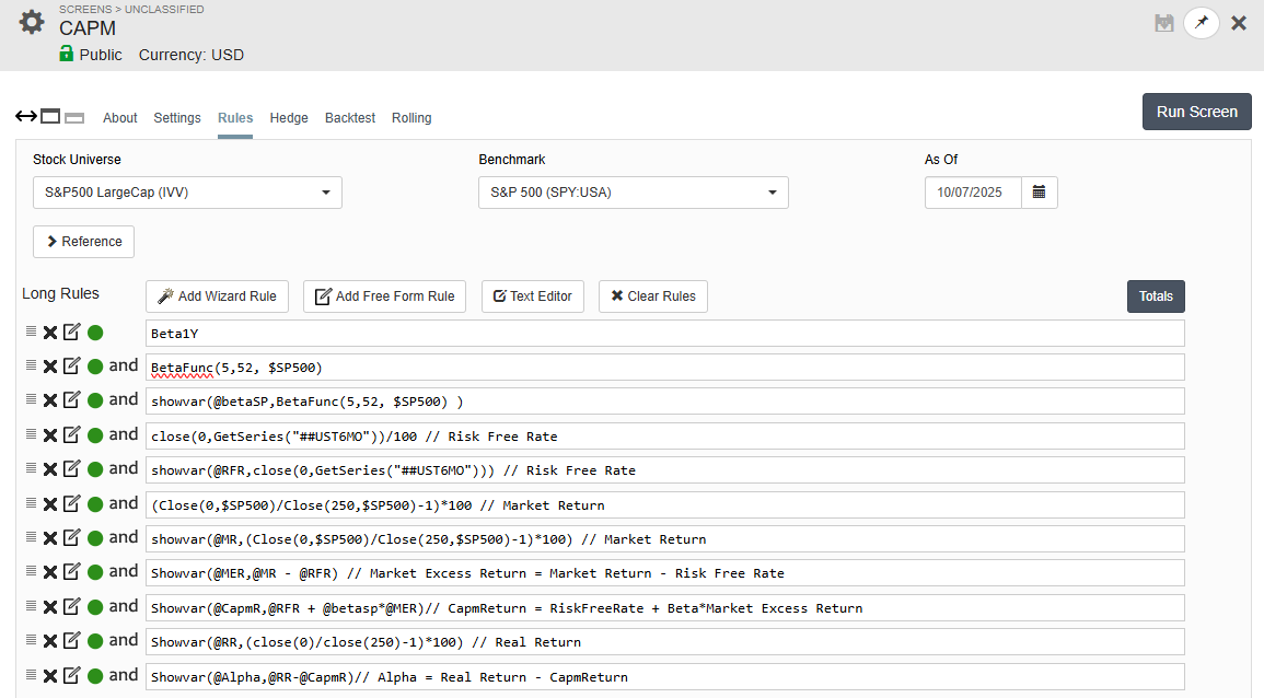
The screenshot below shows the CAPM screen, which calculates every component of the Capital Asset Pricing Model step by step. I have made the screen public so anyone can explore it

CAPM formula:

Expected Return = Risk-Free Rate + Beta × (Market Return – Risk-Free Rate)

In the screen’s variable format:

@CapmR = @RFR + @betaSP × (@MR@RFR)

Here’s what each part of the screen does:

  1. @betaSP – Calculates each stock’s beta versus the S&P 500 (SPY)

  2. @RFR – Fetches the 6-month Treasury bill yield from GetSeries("UST6MO")

  3. @MR – Measures the S&P 500’s 1-year price return

  4. @MER – Computes the Market Excess Return = Market Return – Risk-Free Rate

  5. @CapmR – Calculates the CAPM-predicted return = Risk-Free Rate + Beta × Market Excess Return

  6. @RR – Actual 1-year stock return

  7. @Alpha – Difference between actual and predicted return = Real Return – CAPM Return

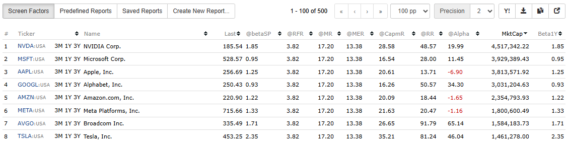
The function ShowVar(@name, expression) makes the screen interactive. It both stores each calculation in a variable and displays it as a column, allowing you to view (Screen Factors), compare, and export every CAPM component directly from the results table.

Visualizing the Results

By running the screen and exporting the results to excel or google sheets, you can plot Beta vs. Actual Return to visualize how real-world performance compares to the theoretical CAPM line and see firsthand that the relationship is weak in practice.

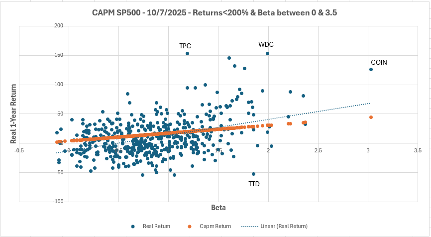
Comparing CAPM-Predicted vs. Realized Returns for S&P 500 Stocks (as of Oct 7, 2025)
This chart shows how each stock’s actual 1-year return (blue dots) compares to its CAPM-expected return (orange).
If CAPM held perfectly, all points would lie on the orange line, but in reality, returns scatter widely, showing that beta explains little of actual performance.

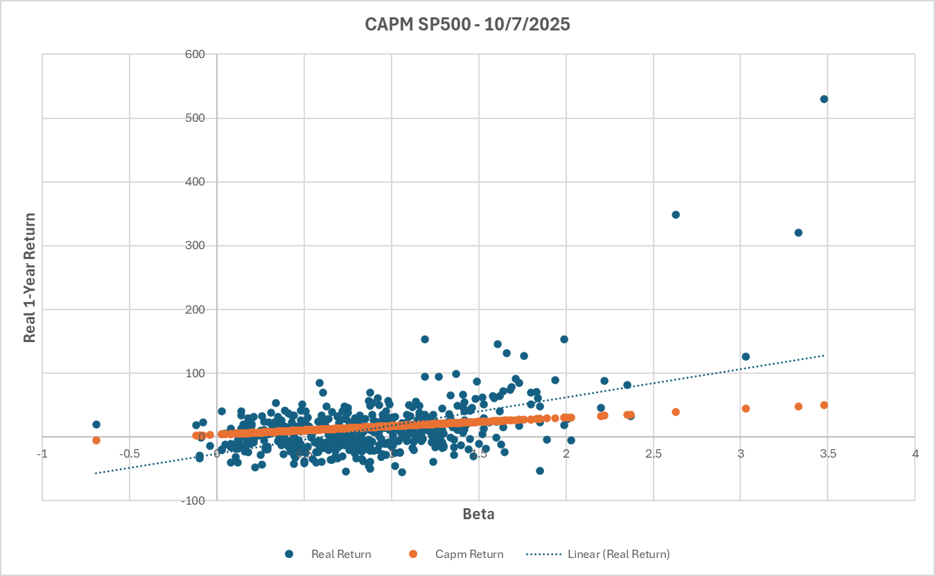
The CAPM model predicts a clean linear link between beta and expected return, but real data tells a different story. Using the screener, you can break down each component of the model and test it with live market data, turning textbook theory into real quantitative insight.

The dot at around 530% return and 3.48 beta represents Robinhood (HOOD), one of several clear examples where actual performance diverges dramatically from what CAPM would predict.

What’s Next?

For students, researchers, or professors exploring quantitative finance, the next step is to extend this test beyond CAPM. Try adding Fama–French 3- or 5-factor models to capture size, value, and profitability effects, or run statistical regressions to measure how much of return variation each model explains (R², t-stats, alpha significance). Portfolio123 gives you the flexibility to replicate academic studies and see which theories still hold up in modern markets.

Join the Discussion

I love to hear from the broader community of academics, quants, and finance enthusiasts. What other financial theories have you tested with Portfolio123. Market efficiency, risk premia, idiosyncratic risk, investor sentiment, or adaptive markets? Share your insights, experiments, or ideas for exploring the next generation of investment theory through data-driven testing.

5 Likes

Very nice! A couple of observations:

The outliers have a HUGE amount of leverage in this linear regression. To the point that — if you really wanted to — you could probably remove the 3 outliers on the right, and confirm the CAPM model!

Not sure you’d want to do that. But if you do keep them, then clearly there’s a real point here about the effect of extreme outliers on predictions — especially in our AI models.

Theoretically, what basis would you have for removing them in a study? I could imagine some academics doing so by labeling them as the result of noise traders — attributing the deviation to behavioral effects, retail investor overreaction, or short-term mispricing. And they might even be right about that… perhaps?

But I might be inclined to keep the outliers — to show that markets aren’t efficient because of noise traders (and their effect on stocks like Robinhood).

Some clarification of leverage:

High-leverage points sit far out on the x-axis (e.g., very high or low beta) and can strongly pull the regression line toward themselves, even if their actual y-value (e.g., return) doesn’t follow the trend.

They have the potential to distort the slope of the line — not because they’re wrong, but because they are rare and sit in a position to influence the fit disproportionately*.*

2 Likes

From the various academic papers I've read, academics usually Winsorize outliers to the first and ninety-ninth percentiles, FWIW. In my own opinion it's important to either Winsorize or trim outliers in all one's research, especially if you're doing any sort of regression, unless you're specifically studying tail events.

1 Like

Thanks.

Do you still use elliptical trimming (or Cook’s Distance) at times? Seems like there might be a case for considering it here as well — given the high leverage of the outliers in this data.

Even if someone wanted to keep those outliers (for whatever reason), the leverage they exert can give a misleading impression about the slope for almost all the other data points. These extreme values on the x-axis lead to a slope that looks quite different from what you’d get if they weren’t so far out (still extreme).

Kind of a random effect on the slope depending on where the are on the x-axis. Hmmmm…random? Quite the assumption

Maybe not so random? Probably not in fact. One might also consider whether the data is non-linear or heteroskedastic. Both would undermine the assumptions behind standard linear regression and could explain why the slope appears so sensitive to extreme values along the x-axis.

I think it’s fine to remove (trim), or Winsorize points — but it’s worth pausing to consider why those points are there in the first place:

  • Is it noise trading? If so, that might offer insight into behavioral finance.
  • Is it non-linearity that could be exploited with a different model — especially if other quants are overlooking it?
  • Is it heteroskedasticity, in which case an inverse-variance regression might be the right tool? That’s a standard approach for handling this issue and would likely smooth out the regression line without discarding the data.

I suspect that an inverse-variance regression would make the relationship look much more linear — and might render the rest of this discussion moot.

It might be worth considering before throwing those data points out

Lots to think about, and I don’t think there’s an easy answer. In an academic context, it seems reasonable to expect that researchers explicitly state which data points they remove — and why.

For our models, it would be ideal if a more advanced model could have trained on Robinhood — told me to buy it — and done so without distorting the slope for all the other data points.

I don’t claim that would be easy to achieve in practice, but I’d probably start with something relatively simple — like an inverse-variance weighted regression.

Addendum: Because you’re using beta — which reflects variance — on the x-axis, your plot is a strong indication that heteroskedasticity is likely present in the data.

And considering that CAPM is designed to account for all aspects of risk — including the increased variability of returns (i.e., heteroskedasticity) — your plot may actually serve as strong confirmation of the CAPM when this Heteroskedasticity is corrected for.

Yes, I do. For anything performance-based, I measure alpha by plotting against the benchmark and then using elliptical trimming.

Was that generated by an AI bot or did you write it? Anyway, the reason these points are there in the first place is because financial return data has fat tails (and heteroskedasticity is one way of saying that). I have not been able to figure out what an inverse-variance regression involves, and when I asked ChatGPT about it, it started making stuff up. If you have a method to implement inverse-variance regression in Excel, I'd be glad to try it. Like I said, the reason I use elliptical trimming rather than DFFITS is that it's easier for me.

A direct answer to your question:

Noise trading as an explanation for the outliers was my idea. ChatGPT help make my idea more readable.

The possibility of non-linearity is obvious and no one should need a LLM to consider that as a possibility.

As I recall, I was discussing homoskedasticity in a different context earlier this morning — with ChatGPT, actually — as I was working to improve one of my own models. So it was already top of mind when I made the post.

I originated the idea of improving my linear models with inverse-volatility weighting. It’s not really a new or particular advanced idea for linear regressions. But sometimes ChatGPT helps me with ideas like that while–at times–the ideas are new or forgotten in the forum.

But also — I’ve checked for homoskedasticity in P123 data in the past. It’s been a while, but what I found is that many of the features we rely on are nowhere close to homoskedastic.

We’re likely violating this assumption for most features, and this isn’t new — it just tends to get forgotten.

I addressed heteroskedasticity in a forum post years ago — well before the rise of LLMs. It’s one of those issues that seems to get recycled, over and over, with no memory in the forum. Ranking and market timing in combination for stock forecasting models - #10 by Jrinne

I was implementing a version of inverse-variance weighting this morning for an AI model. Not sure I can help you with an Excel version of that. But pretty simple in Python.

Here is a link that may be helpful: Solving the problem of heteroscedasticity through weighted regression

Also Wikipedia: Weighted least squares

Regardless, it is worth looking at some of our assumptions for P123’s AI in my opinion.

This is strong empirical work — but to get published in a peer-reviewed journal, you’d likely need to explicitly address outliers, model assumptions, and heteroskedasticity. That’s especially true when you’re evaluating something as foundational (and widely defended) as CAPM.

In a thread discussing the academic use of P123, I think this is a serious contribution to the topic

Thanks for the links! They were pretty helpful in explaining what's involved.

I can't implement this in Excel; I don't think anyone could. So I guess I'll stick with elliptical trimming. I should probably learn Python one of these days. A lot to do.

3 Likes

Thanks for all the input! I’ve winsorized the data as follows:

  • capped returns at 200%
  • limited beta between 0 and 3.5.

The new plot shows a slightly better fit, but still plenty of outliers. Even after cleaning up the extremes, it’s clear that beta alone doesn’t explain much of the variation in returns.

There’s still a wide spread of stocks above and below the CAPM line, suggesting other factors like size, value, momentum, or idiosyncratic risk are driving a big part of real-world performance.

Thanks for the great points about outlier leverage. How just a few extreme data points can pull the regression line. From an academic standpoint, winsorizing makes sense to me because the goal is to reach a model that best explains market behavior overall. But from an investor’s standpoint, I actually want those outliers in my portfolio that’s where a lot of the alpha and asymmetry come from.

So there’s a tradeoff: academics clean the data to find generalizable relationships, while I would like to embrace the exceptions (+100% returns) in my portfolio.

Another thing that stands out in the chart is how several low-beta stocks are actually doing really well and performing above the CAPM line. In theory, these lower-risk names should earn less, but in reality, many of them outperform. That lines up with the low-volatility anomaly, the idea that steady, lower-beta stocks can quietly beat their high-volatility counterparts over time. It’s cool to see it show up visually in the data that I tested.

2 Likes

It is important to remember that CAPM is not a theory, but a model based on a seemingly failed hypothesis. Hence the need for the newer but still imperfect multi-factor models we have today.

Nice point. In fact, Winsorizing and especially elliptical trimming would remove every stock I want to train upon. Every stock I want to buy in other words. The last bucket below being an example. It has a large amount of leverage and it would be Winsorized as a regression. P123 makes explicit that it is a regression by calculating a slope and drawing a regression line. A regression using ranks.

I honestly have no idea why I would want to create a model that had no stocks that I want to buy in that model. It makes no sense to me..

And just a thought. Using ranks may lessen the impact of outliers for some method/models. This is be because we are not really trying to predict the returns. We really just care about a rank ordering of the stocks.

As long as we are dealing with ranks and monotonically increasing data (with P123 and not your study necessarily), we actually do not care if the slope is biased (or just plain wrong) as long as the model tells us to buy the same stocks–which it does regardless of the slope as long as the slope is positive.

This is one of the hidden (or seldom talked about) benefits of P123 classic!!! Specifically, its non-parametric nature and focus on rank ordering.

Thanks for making this important point!

2 Likes

Well…capm in a perfect market it has sense.

  1. if people weren't chasing ghost over their intrinsec value and pushing the high beta stocks higher and higher maybe capm will work better (and viceversa with bored bussines and low beta stocks). I am sure that if we take only the stocks with the correct intrinsec valuation (hard to find without error :fire::joy:) and we will apply the model other results will appear = market efficiency anyway

  2. betas are difficult to estimate pretty well in terms of stock (the issue and error is huge here) you can take and up down approach as Damodaran do for example to estimate it better and reduce the issue.

of course there are several more factors that affect all of this theory…just my point

1 Like

The problem with this line of thinking is that you're not considering the relationship between in-sample and out-of-sample results. I know of no study in which that relationship is improved by forgoing trimming or Winsorizing. Outliers are wonderful things when you're talking about out-of-sample returns, but in-sample results should always be trimmed or Winsorized when you're doing linear regression. There are alternate approaches to linear regression that could be considered, for which trimming/Winsorizing is not (as) essential. But that's another discussion. The fact is that outliers have a much larger impact on linear regression than non-outliers. It's not so much a question of excluding/modifying data that doesn't really fit: it's a question of giving that data less of an outsized influence. Remember that linear regression is performed by squaring the distance from the mean, so the greater that distance is, the more substantial the effect of the outlier.