Thanks for all the input! I’ve winsorized the data as follows:
- capped returns at 200%
- limited beta between 0 and 3.5.
The new plot shows a slightly better fit, but still plenty of outliers. Even after cleaning up the extremes, it’s clear that beta alone doesn’t explain much of the variation in returns.
There’s still a wide spread of stocks above and below the CAPM line, suggesting other factors like size, value, momentum, or idiosyncratic risk are driving a big part of real-world performance.
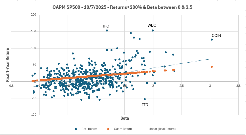
Thanks for the great points about outlier leverage. How just a few extreme data points can pull the regression line. From an academic standpoint, winsorizing makes sense to me because the goal is to reach a model that best explains market behavior overall. But from an investor’s standpoint, I actually want those outliers in my portfolio that’s where a lot of the alpha and asymmetry come from.
So there’s a tradeoff: academics clean the data to find generalizable relationships, while I would like to embrace the exceptions (+100% returns) in my portfolio.
Another thing that stands out in the chart is how several low-beta stocks are actually doing really well and performing above the CAPM line. In theory, these lower-risk names should earn less, but in reality, many of them outperform. That lines up with the low-volatility anomaly, the idea that steady, lower-beta stocks can quietly beat their high-volatility counterparts over time. It’s cool to see it show up visually in the data that I tested.