I have been taking the google ML courses below and am trying to transform and visualize my data before starting with the “ML” part. However, even with zscores the data is far from a normal distribution and almost impossible to visualize.
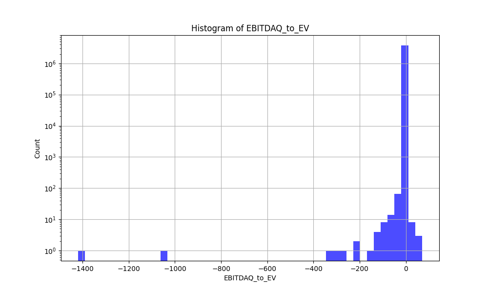
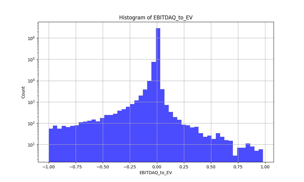
Here is an example of what I have generally done to plot the data in a more human readable format. And some examples of why the raw zscores are not human readable…
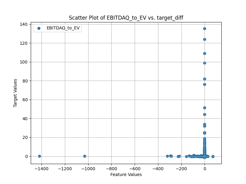
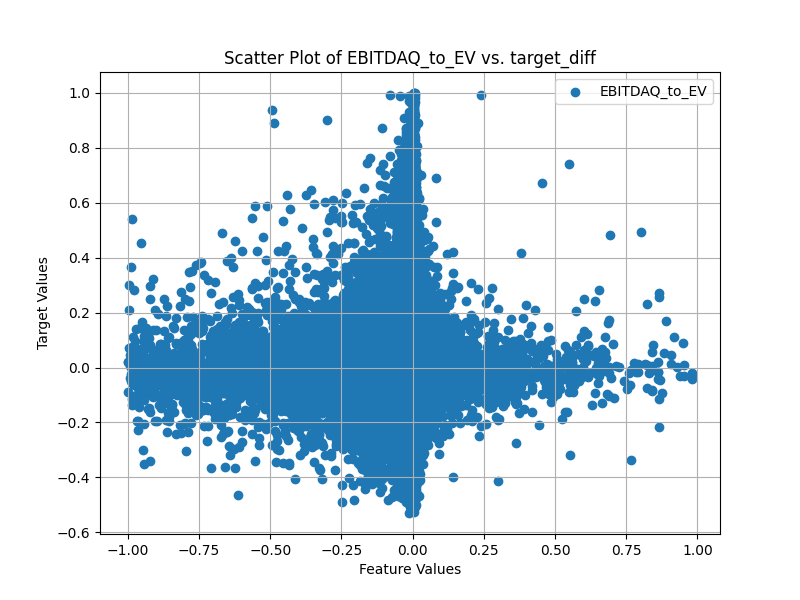
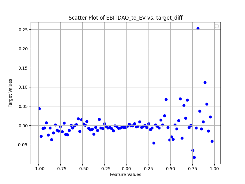
Next are scatter plots which are sub-sampled as I have about 3 million points. Also the target_diff is a sigmoid transform x/(1+abs(x) of the next week return alpha (open(-6)/open(-1)-1-universe return). I will note that this means that for small values of the target the sigmoid transform does little to the value. I think something longer than 1 week would have a more visible trend, but I have not written the code to calculate the alpha for longer periods yet.
Note the tighter area near zero is likely because my bins are not based on the number of points in each bin so the bins near zero are an average of a lot more points.
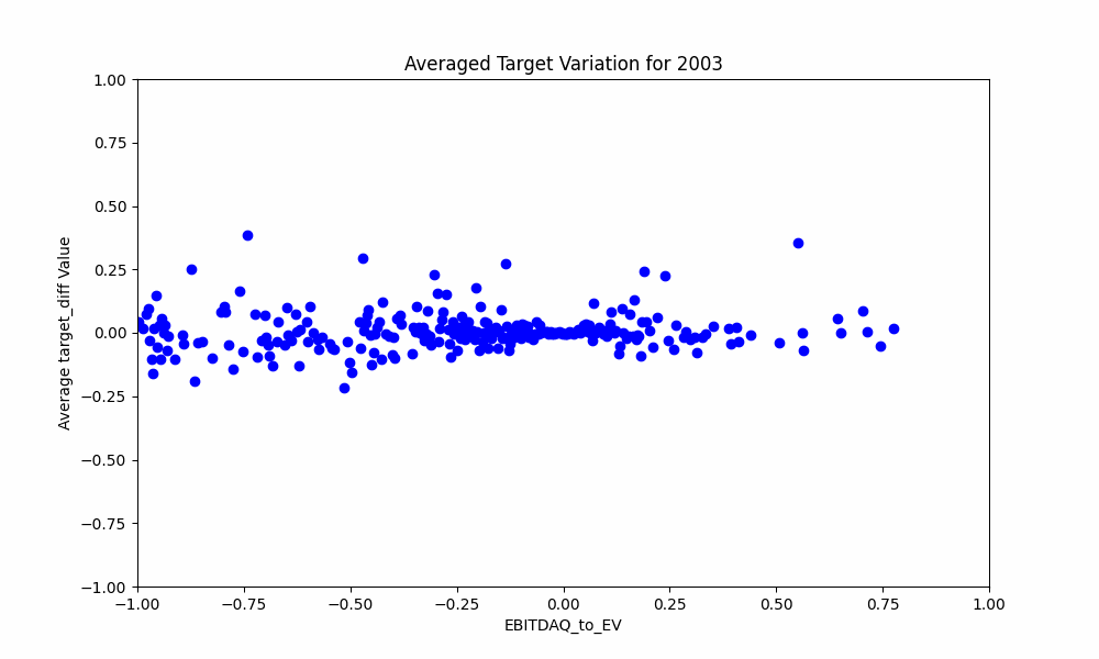
Finally mostly for fun an animation of how the data changes every year:
I also tried doing scatter plots of a feature vs say mktcap with color for the target value, but I could not see any trend with my plotting method. Overall P123s method of return histograms or the binned scatter plots seem to be the only thing that makes sense when trying to visualize feature to target relationships. I am curious if others have found better methods they are willing to share!
Also while this does help give a feeling for the data I imagine a more automated feature picking system would use things like Spearman’s Rank Correlation, so this may all be a goose chase…
First, it is better not to make any distributional assumptions, especially with stock data as it is not normally distributed. Second, you may need to treat extreme values in some way. I would not go straight cutting them out, but if I cannot find a good reason, trimming could be an option. For visualization purpose, you can try some transformations, but finding simple correlations that are useful for trading is not likely from stock data. I would look into some multivariate technics and even then it is difficult find signal out from all the noise.
@jlittleton i can confirm that the histogram looks like this most of the time and yes, is did not found any help on plotting them
Second I tried some denoising, explained in the books from de Prado, as well as some normalization. Did not see any effect on the outcome.
But you can as well plot the denoising results - not sure if that helps.
The biggest inside I ever saw, was using alphalense (from Quantopian, s GITHUB).
Special the 3 month rolling return of the single factor. If you want to use this, you need to install zipline.
But you might check out calculations from existing factors. I clearly shows how this factors change over time. Quite interesting.
The most susses full step on data treatment was filtering with feature impotence.
As I always plot my returns ML against equal weights rankings, usually equal weights win.
Don’t understand me wrong, feature impotence improves the results, but obviously as well for equal weights.
Based on this, plotting feature impotence gives you some insights.
Of course you can as well plot the correlation among the different factors, and only use the ones with differ the most.
I’m really curious what needs to be done to the data, in oder that the ML select superior stocks than the simple equal weight method.
I’m quite sure, the issue is to clean up the data better!
But I don’t know how to check this before…I would as well appreciate some suggestions
This is why you often see rank strategy performance plotted a decile groups — otherwise you wouldn’t see anything! The data is extremely noisy.
One thing that’s worked for me in other fields is: standardize(log(x+1)); then cap everything at -5 or 5 (I.e., standard deviations). You could almost consider it a 10 point score. Obviously this won’t work for everything (positive only), but it’s handy to have.