The Moving Average Strategy
In 2006, Mebane Faber of Cambria Investments published an important white paper in which he introduced a new strategy for implementing the time-honored practice of trend-following. His proposed strategy is captured in the following steps:
(1) For a given risk asset, at the end of each month, check the closing price of the asset.
(2) If the closing price is above the average of the 10 prior monthly closes, then go long the asset and stay long through the next month.
(3) If the price is below the average of the 10 prior monthly closes, then go to cash, or to some preferred proxy for a safe asset, and stay there through the next month.
Notably, this simple strategy, if implemented when Faber proposed it, would have gone on to protect investors from a 50% crash that began a year later. After protecting investors from that crash, the strategy would have placed investors back into long positions in the summer of 2009, just in time to capture the majority of the rebound. It’s hard to think of many human market timers that managed to perform better, playing both sides of the fence in the way that the strategy was able to do. It deserves respect.
To make the strategy cleaner, I would offer the following modification: that the strategy switch based on total return rather than price. When the strategy switches based on total return, it puts all security types on an equal footing: those whose prices naturally move up over time due to the retention of income (e.g., growth equities), and those that do not retain income and whose prices therefore cannot sustainably move upwards (e.g., high-yield bonds).
Replacing price with total return, we arrive at the following strategy:
(1) For a given risk asset, at the end of each month, check the closing level of the asset’s total return index. (Note: you can quickly derive a total return index from a price index by subtracting, from each price in the index, the cumulative dividends that were paid after the date of that price.)
(2) If the closing level of the total return index is above the average of the 10 prior monthly closing levels, then go long the asset and stay long through the next month.
(3) If the closing level of the total return index is below the average of the 10 prior monthly closing levels, then go to cash, or to some preferred proxy for a safe asset, and stay there through the next month.
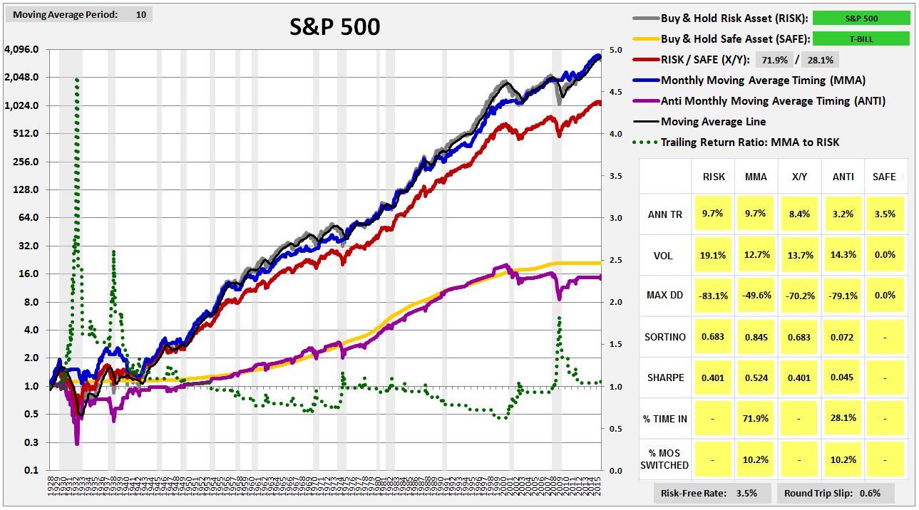
We will call this strategy MMA, which stands for Monthly Moving Average strategy. The following chart shows the performance of MMA in the S&P 500 from February of 1928 to November of 2015. Note that we impose a 0.6% slip loss on each round-trip transaction, which was the average bid-ask spread for large company stocks in the 1928 – 2015 period:
(For a precise definition of each term in the chart, click here.)
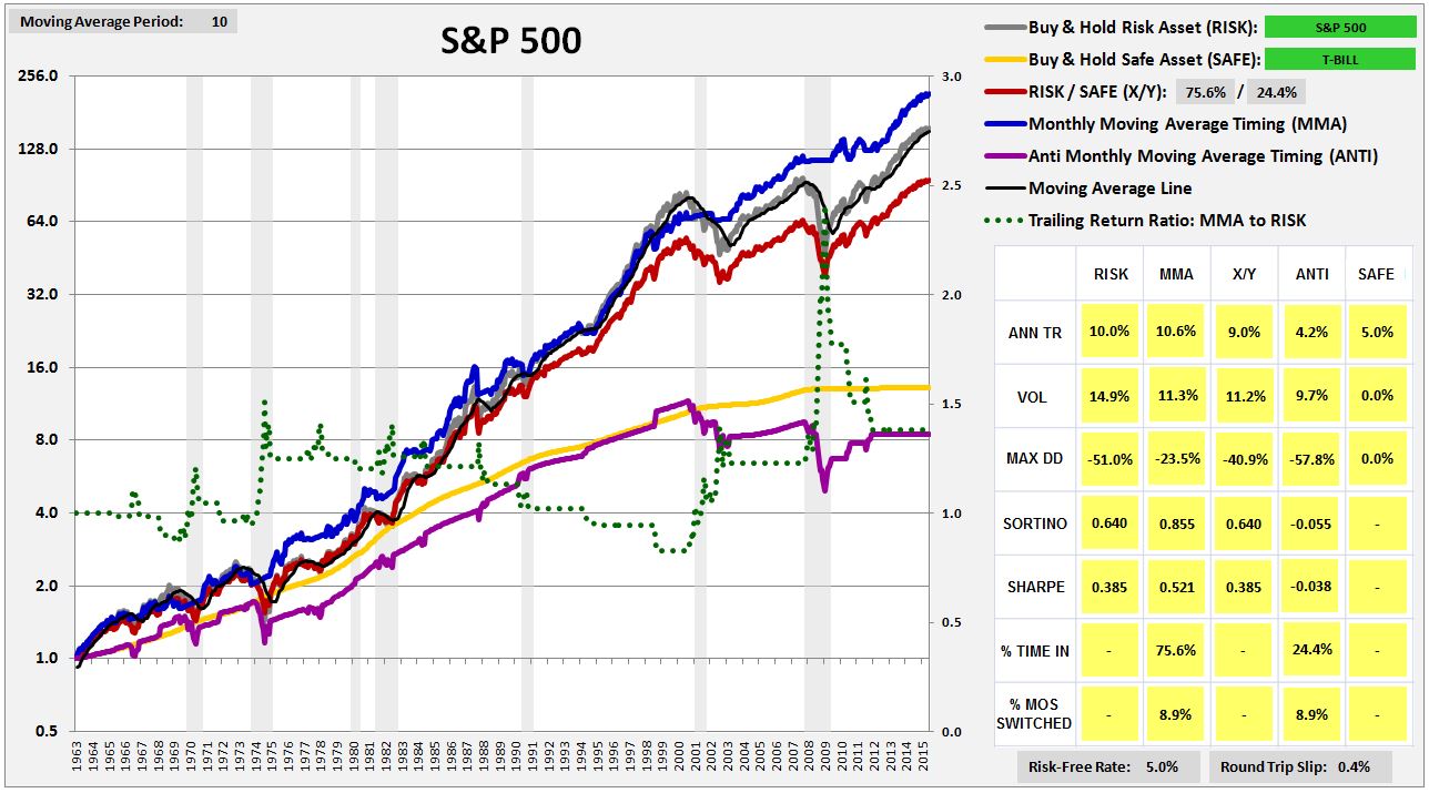
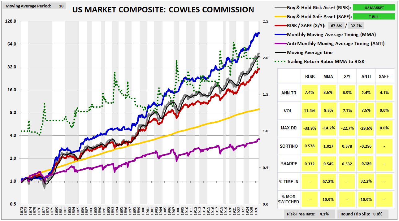
The blue line in the chart is the total return of MMA. The gray line is the total return of a strategy that buys and holds the risk asset, abbreviated RISK. In this case, RISK is the S&P 500. The black line on top of the gray line, which is difficult to see in the current chart, but which will be easier to see in future charts, is the moving average line. The yellow line is the total return of a strategy that buys and holds the safe asset, abbreviated SAFE. In this case, SAFE is the three month treasury bill, rolled over on a monthly basis. The purple line is the opposite of MMA–a strategy that is out when MMA is in, and in when MMA is out. It’s abbreviated ANTI. The gray columns are U.S. recession dates.
The dotted green line shows the timing strategy’s cumulative outperformance over the risk asset, defined as the ratio of the trailing total return of the timing strategy to the trailing total return of a strategy that buys and holds the risk asset. It takes its measurement off of the right y-axis, with 1.0 representing equal performance. When the line is ratcheting up to higher numbers over time, the strategy is performing well. When the line is decaying down to lower numbers over time, the strategy is performing poorly.
We can infer the strategy’s outperformance over any two points in time by examing what happens to the green line. If the green line ends up at a higher place, then the strategy outperformed. If it ends up at a lower place, then the strategy underperformed. As you can see, the strategy dramatically outperformed from the late 1920s to the trough of the Great Depression (the huge spike at the beginning of the chart). It then underperformed from the 1930s all the way through to the late 1960s. From that point to now, it’s roughly equal performed, enjoying large periods of outperformance during market crashes, offset by periods of underperformance during the subsequent rebounds, and a long swath of underperformance during the 1990s.
Now, it’s not entirely fair to be evaluating the timing strategy’s performance against the performance of the risk asset. The timing strategy spends a significant portion of its time invested in the safe asset, which has a lower return, and a lower risk, than the risk asset. We should therefore expect the timing strategy to produce a lower return, with a lower risk, even when the timing strategy is improving the overall performance.
The appropriate way to measure the performance of the timing strategy is through the use of what I call the “X/Y portfolio”, represented by the red line in the chart. The X/Y portfolio is a mixed portfolio with an allocation to the risk asset and the safe asset that matches the timing strategy’s cumulative ex-post exposure to each asset. In the present case, the timing strategy spends roughly 72% of its time in the risk asset, and roughly 28% of its time in the safe asset. The corresponding X/Y portfolio is then a 72/28 risk/safe portfolio, a portfolio continually rebalanced to hold 72% of its assets in the S&P 500, and 28% of its assets in treasury bills.
If a timing strategy were to add exactly zero value through its timing, then its performance–its return and risk–would be expected to match the performance of the corresponding X/Y portfolio. The performances of the two strategies would be expected to match because their cumulative asset exposures would be identical–the only difference would be in the specific timing of the exposures. If a timing strategy can consistently produce a better return than the corresponding X/Y portfolio, with less risk, then it’s necessarily adding value through its timing. It’s taking the same asset exposures and transforming them into “something more.”
When looking at the charts, then, the way to assess the strategy’s skill in timing is to compare the blue line and the red line. If the blue line is substantially above the red line, then the strategy is adding positive value and is demonstrating positive skill. If the blue line equals the red line to within a reasonable statistical error, then the strategy is adding zero value and is demonstrating no skill–the performance equivalent of randomness. If the blue line is substantially below the red line, then the strategy is adding negative value and is demonstrating negative skill.
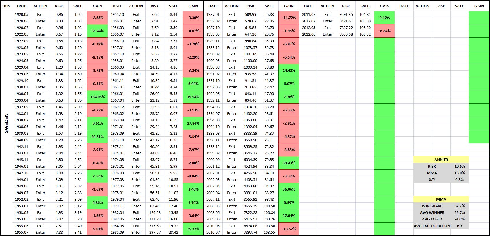
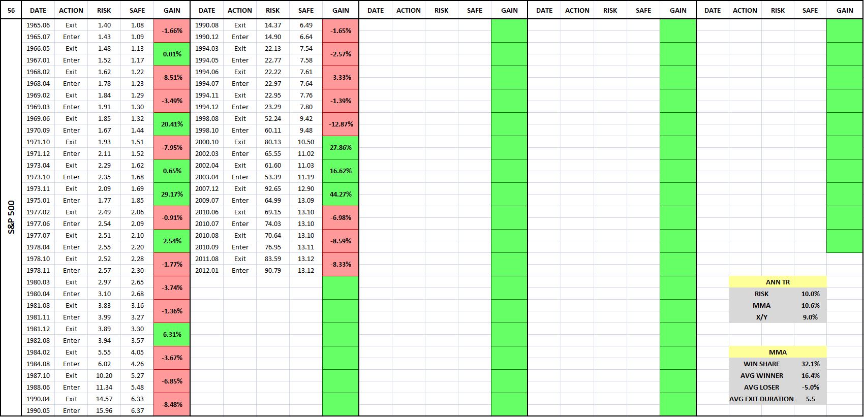
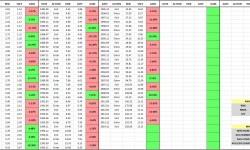
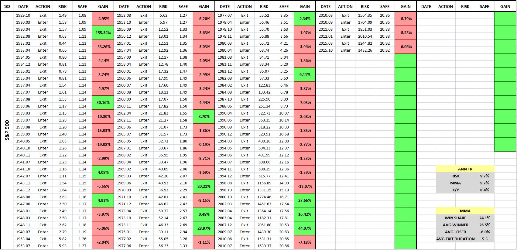
The following table shows the entry-exit dates associated with the previous chart:
(For a precise definition of each term in the table, click here.)
Each entry-exit pair (a sale followed by a purchase) produces a relative gain or loss on the index. That relative gain or loss is shown in the boxes in the “Gain” column, which are shaded in green for gains and in red for losses. You can quickly look at the table and evaluate the frequency of gains and losses by gauging the frequency of green and the red.
What the table is telling is that the strategy makes the majority of its money by avoiding large, sustained market downturns. To be able to avoid those downturns, it has to accept a large number of small losses associated with switches that prove to be unnecessary. Numerically, more than 75% of all of MMA’s trades turn out to be losing trades. But there’s a significant payout asymmetry to each trade: the average winning trade produces a relative gain of 26.5% on the index, whereas the average losing trade only inflicts a relative loss of -6.0%.
Comparing the Results: Two Additional Strategies
In addition to Faber’s strategy, two additional trend-following strategies worth considering are the moving average crossover strategy and the momentum strategy. The moving average crossover strategy works in the same way as the moving average strategy, except that instead of comparing the current value of the price or total return to a moving average, it compares a short horizon moving average to a long horizon moving average. When the short horizon moving average crosses above the long horizon moving average, a “golden cross” occurs, and the strategy goes long. When the short horizon moving average crosses below the long horizon moving average, a “death cross” occurs, and the strategy exits. The momentum strategy also works in the same way as the moving average strategy, except that instead of comparing the current value of the price or total return to a moving average, it compares the current value to a single prior value–usually the value from 12 months ago.
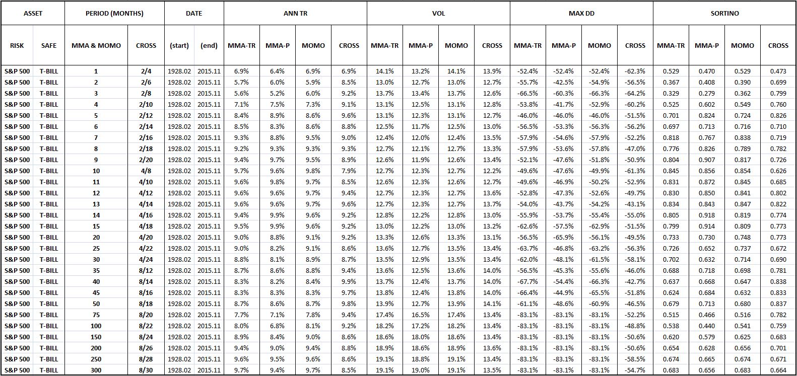
The following table shows the U.S. equity performance of Faber’s version of the moving average strategy (MMA-P), our proposed total return modification (MMA-TR), the moving crossover strategy (CROSS), and the momentum strategy (MOMO) across a range of possible moving average and momentum periods:
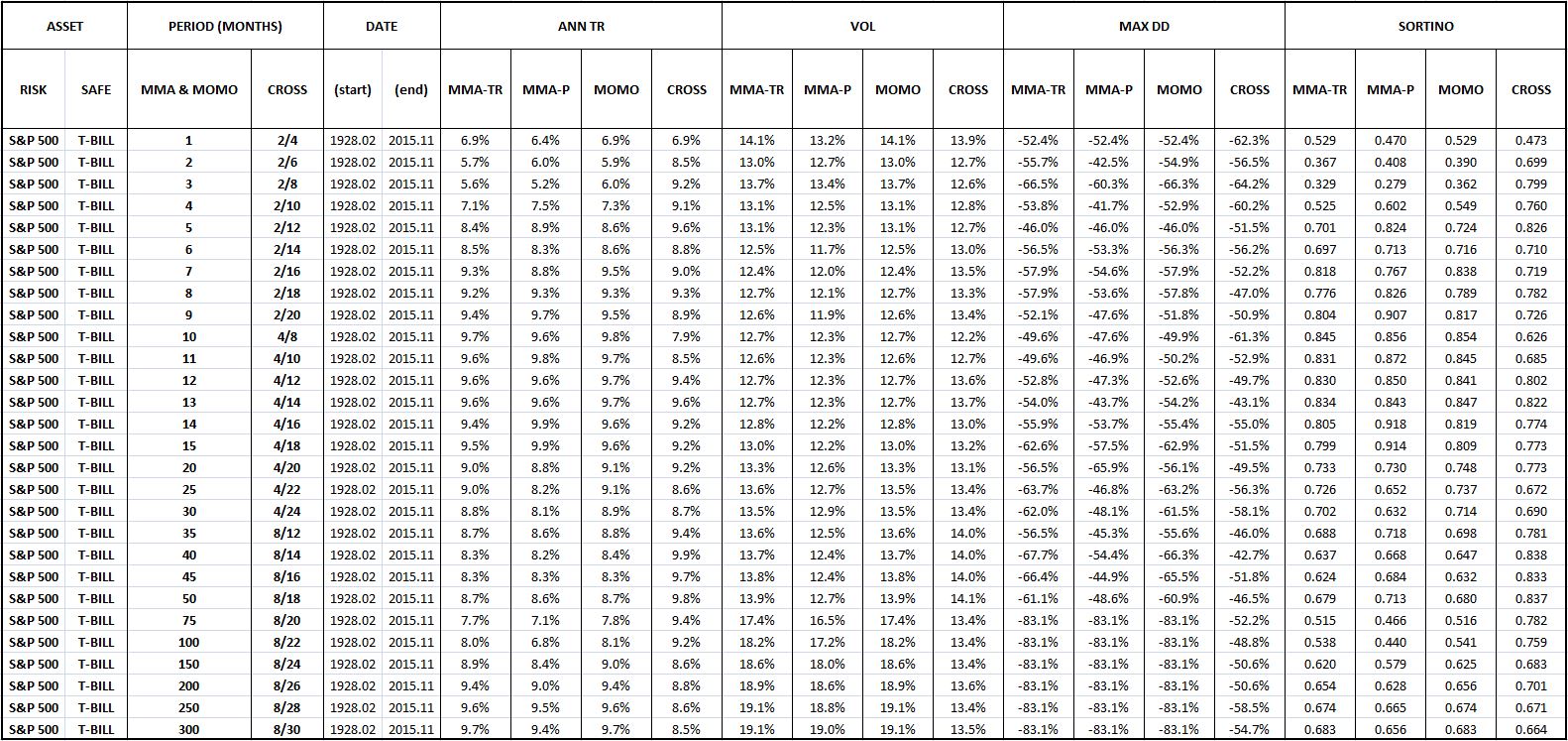
If you closely examine the table, you will see that MMA-TR, MMA-P, and MOMO are essentially identical in their performances. The performance of CROSS diverges negatively in certain places, but the comparison is somewhat artificial, given that there’s no way to put CROSS’s two moving average periods onto the same basis as the single periods of the other strategies.
Despite similar performances in U.S. equities, we favor MMA-TR over MMA-P because MMA-TR is intuitively cleaner, particular in the fixed income space. In that space, MMA-P diverges from the rest of the strategies, for the obvious reason that fixed income securities do not retain earnings and therefore do not show an upward trend in their prices over time. MMA-TR is also easier to backtest than MMA-P–only one index, a total return index, is needed. For MMA-P, we need two indices–a price index that decides the switching, and a total return index that calculates the returns.
We favor MMA-TR over MOMO for a similar reason. It’s intuitively cleaner than MOMO, since it compares the current total return level to an average of prior levels, rather than a single prior level. A strategy that makes comparisons to a single prior level is vulnerable to single-point anomalies in the data, whereas a strategy that makes comparison to an average of prior levels will smooth those anomalies out.
We’re therefore going to select MMA-TR to be the representative trend-following strategy that we backtest out-of-sample. Any conclusions that we reach will extend to all of the strategies–particularly MMA-P and MOMO, since their structures and performances are nearly identical to that of MMA-TR. We’re going to use 10 months as the moving average period, but not because 10 months is special. We’re going to use it because it’s the period that Faber used in his original paper, and because it’s the period that just-so-happens to produce the best results in U.S. equities.
Changing Moving Average Periods: A Tweak Test
Settling on a 10 month moving average period gives us our first opportunity to apply the “tweak” test. With respect to the chosen moving average period, what makes 10 months special? Why not use a different number: say, 6, 7, 8, 9, 11, 15, 20, 200 and so on? The number 10 is ultimately arbitrary, and therefore the success of the strategy should not depend on it.
Fortunately, when we apply a reasonable range of numbers other than 10 to the strategy, we obtain similarly positive results, in satisfaction of the “tweak” test. The following table shows the performance of the strategy under moving average periods ranging from 1 month to 300 months, with the performance of 10 months highlighted in yellow:
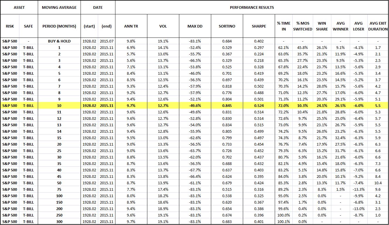
Evidently, the strategy works well for all moving average periods ranging from around 5 months to around 50 months. When periods below around 5 months are used, the strategy ends up engaging in excessive unnecessary switching. When periods greater than around 50 months are used, the moving average ends up lagging the index by such a large amount that it’s no longer able to switch when it needs to, in response to valid signs of impending downtrends.
The following two charts illustrate the point. In the first chart, a 1 month period is used. The strategy ends up switching in roughly 46% of all months–an egregiously high percentage that indicates significant inefficiency. In the second chart, a 300 month period is used. The strategy ends up completely impotent–it never switches, not even a single time.
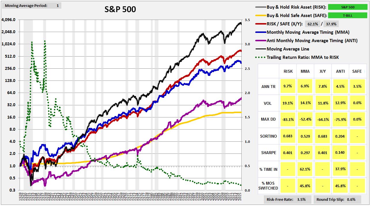
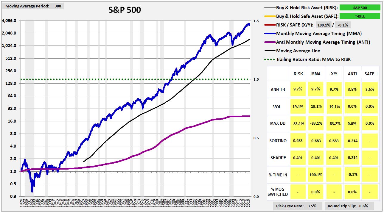
(For a precise definition of each term in the chart, click here.)
Evaluating the Strategy: Five Desired Qualities
Earlier, we identified five qualities that we wanted to see in market timing strategies. They were: analytic, generic, efficient, long-biased, and recently-successful. How does MMA far on those qualities? Let’s examine each individually.
Here, again, are the chart and table for the strategy’s performance in U.S. equities:
(For a precise definition of each term in the chart and table, click here.)
Here are the qualities, laid out with grades:
Analytic? Undecided. Advocates of the strategy have offered behavioral explanations for its efficacy, but those explanations leave out the details, and will be cast into doubt by the results of the testing that we’re about to do. Note that in the next piece, we’re going to give an extremely rigorous account of the strategy’s functionality, an account that will hopefully make all aspect of its observed performance–its successes and its failures–clear.
Generic? Check. We can vary the moving average period anywhere from 5 to 50 months, and the strategy retains its outperformance over buy and hold. Coincidences associated with the number 10 are not being used as a lucky crutch.
Efficient? Undecided. The strategy switches in 10% of all months. On some interpretations, that might be too much. The strategy has a switching win rate of around 25%, indicating that the majority of the switches–75%–are unnecessary and harmful to returns. But, as the table confirms, the winners tend to be much bigger than the losers, by enough to offset them in the final analysis. We can’t really say, then, that the strategy is inefficient. We leave the verdict at undecided.
Long-Biased? Check. The strategy spends 72% of its time in equities, and 28% of its time in cash, a healthy ratio. The strategy is able to maintain a long-bias because the market has a persistent upward total return trend over time, a trend that causes the total return index to spend far more time above the trailing moving average than below.
On a related note, the strategy has a beneficial propensity to self-correct. When it makes an incorrect call, the incorrectness of the call causes it to be on the wrong side of the total return trend. It’s then forced to get back on the right side of the total return trend, reversing the mistake. This propensity comes at a cost, but it’s beneficial in that prevents the strategy from languishing in error for extended periods of time. Other market timing approaches, such as approaches that try to time on valuation, do not exhibit the same built-in tendency. When they get calls wrong–for example, when they wrongly estimate the market’s correct valuation–nothing forces them to undo those calls. They get no feedback from the reality of their own performances. As a consequence, they have the potential to spend inordinately long periods of time–sometimes decades or longer–stuck out of the market, earning paltry returns.
Recently Successful? Check. The strategy has outperformed, on net, since the 1960s.
Cowles Commission Data: Highlighting a Key Testing Risk
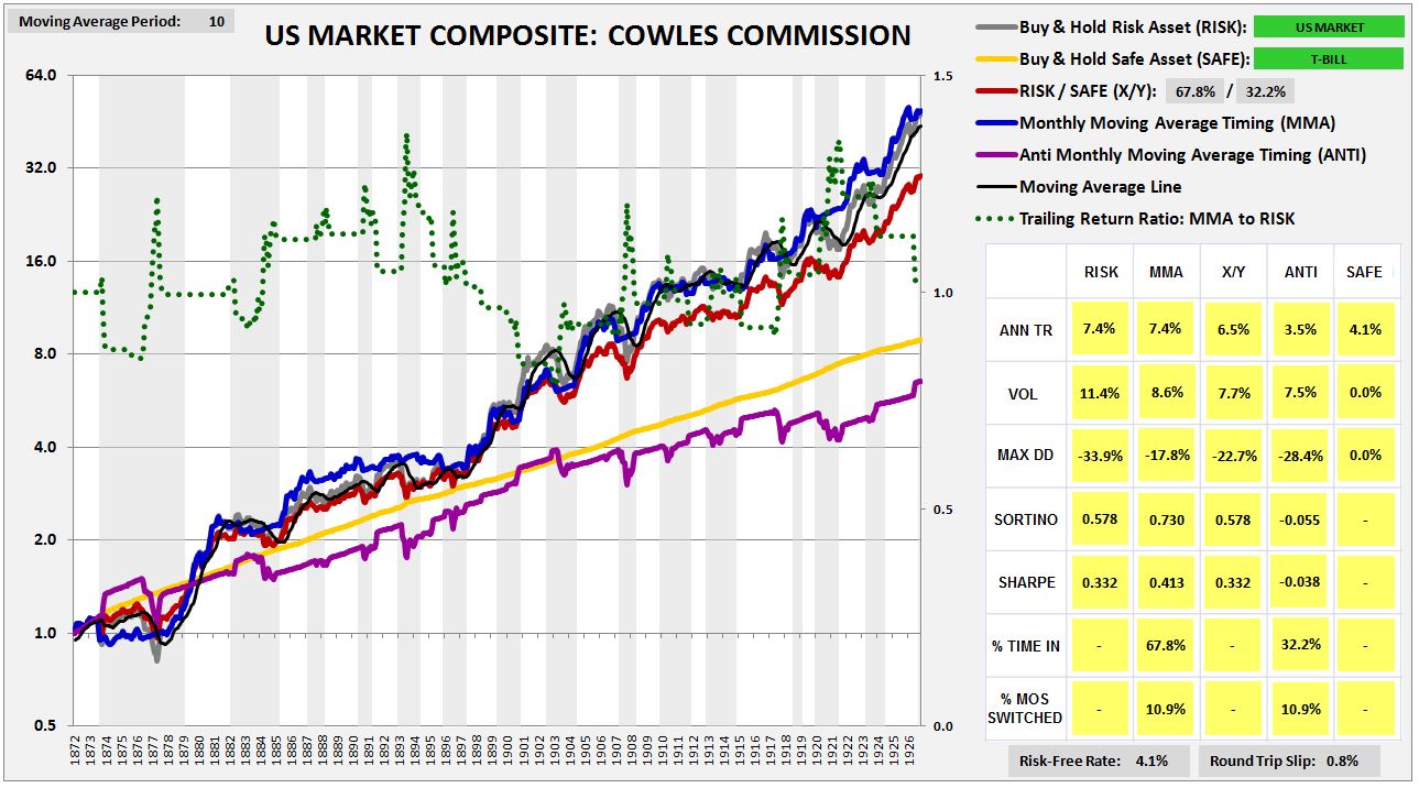
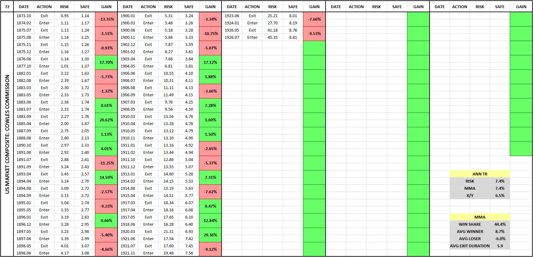
Using data compiled by the Cowles Commission, we can conduct our first out-of-sample test on the strategy. The following chart shows the strategy’s performance in U.S. equities back to the early 1870s. We find that the strategy performs extremely well, beating the X/Y portfolio by 210 bps, with a substantially lower drawdown.
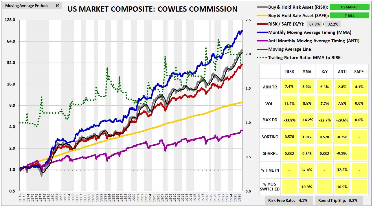
The strong performance, however, is the consequence of a hidden mistake. The Cowles Commission prices that are available for U.S. equities before 1927 are not closing prices, but averages of high and low prices for the month. In allowing ourselves to transact at those prices, we’re effectively cheating.
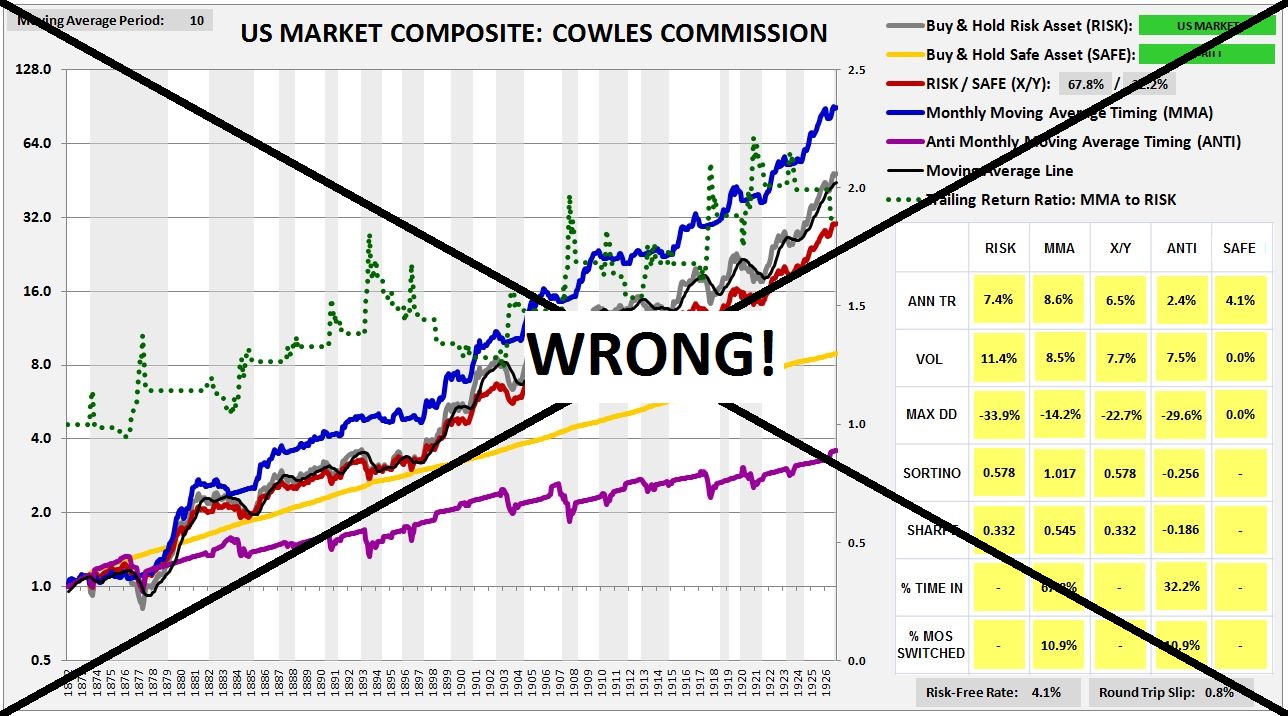
The point is complicated, so let me explain. When the index falls below the moving average, and we sell at the end of the month at the quoted Cowles monthly price, we’re essentially letting ourselves sell at the average price for that month, a price that’s no longer available, and that’s likely to be higher than the currently available price, given the downward price trend that we’re acting on. The same holds true in reverse. When the index moves above the average, and we buy in at the end of the month, we’re essentially letting ourselves buy in at the average price for the month, a price that’s no longer available, and that’s likely to be lower than the closing price, given the upward price trend that we’re acting on. So, in effect, whenever we sell and buy in this way, we’re letting ourselves sell higher, and buy lower, than would have been possible in real life.
To use the Cowles Commission data and not cheat, we need to insert a 1 month lag into the timing. If, at the end of a month, the strategy tells us to sell, we can’t let ourselves go back and sell at the average price for that month. Instead, we have take the entirety of the next month to sell, selling a little bit on each day. That’s the only way, in practice, to sell at an “average” monthly price. Taking this approach, we get a more truthful result. The strategy still outperforms, but by an amount that is more reasonable:
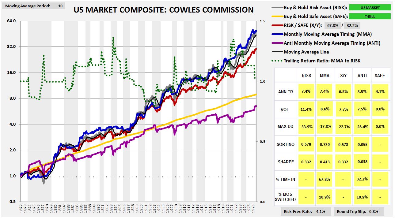
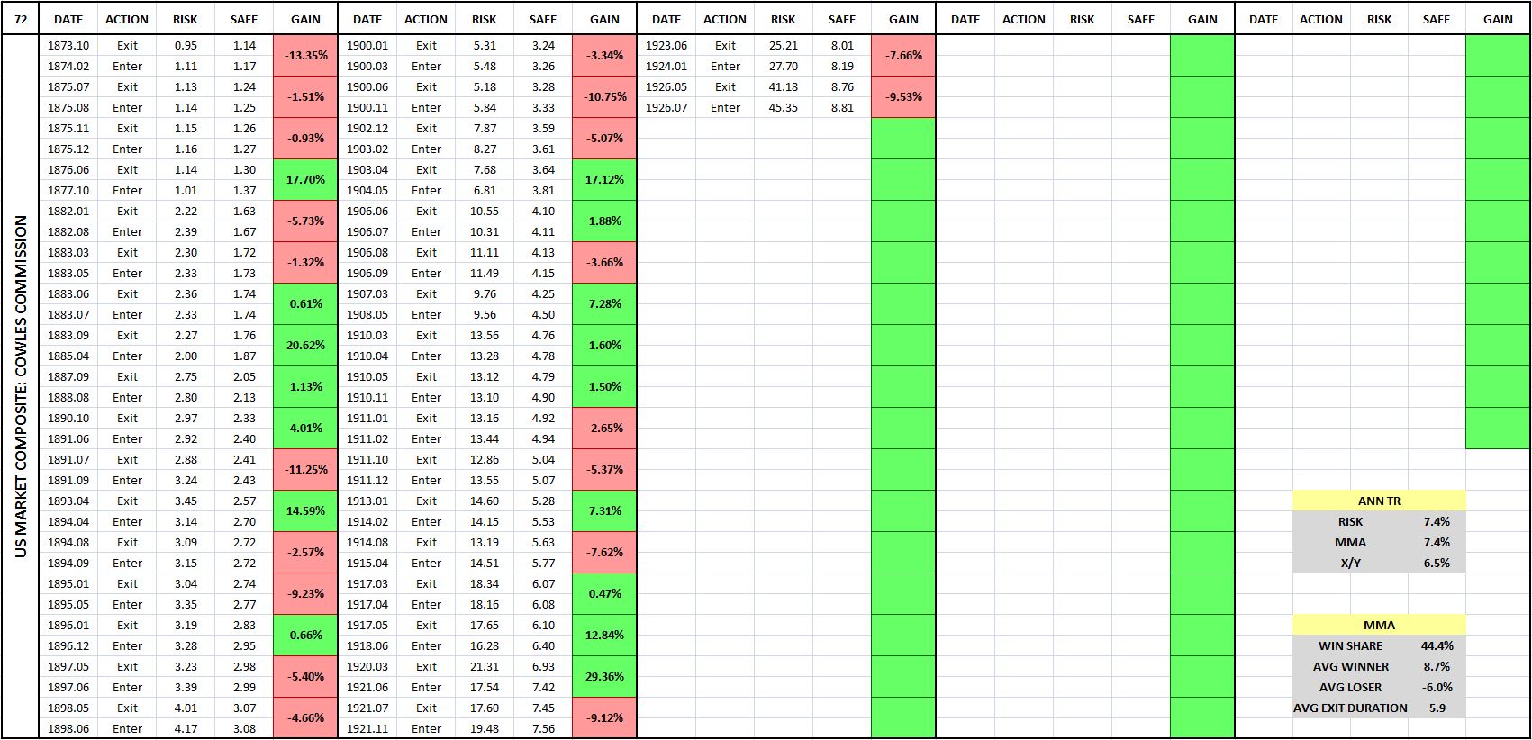
(For a precise definition of each term in the chart and table, click here.)
To avoid this kind of inadvertent cheating in our backtests, we have to make extra sure that the prices in any index that we test our strategies on are closing monthly prices. If an index is in any way put together through the use of averaging of different prices in the month–and some indices are put together that way, particularly older indices–then a test of the moving average strategy, and of all trend-following strategies more generally, will produce inaccurate, overly-optimistic results.
The Results: MMA Tested in 235 Indices and 120 Individual Securities
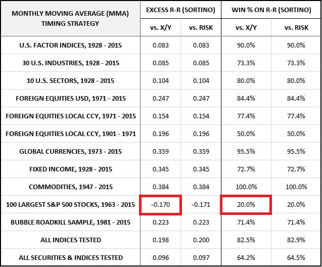
We’re now ready for the results. I’ve divided them in into eleven categories: U.S. Equities, U.S. Factors, U.S. Industries, U.S. Sectors, Foreign Equities in U.S. Dollar Terms, Foreign Equities in Local Currency Terms, Global Currencies, Fixed Income, Commodities, S&P 500 Names, and Bubble Roadkill Names.
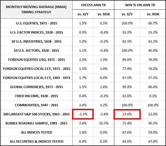
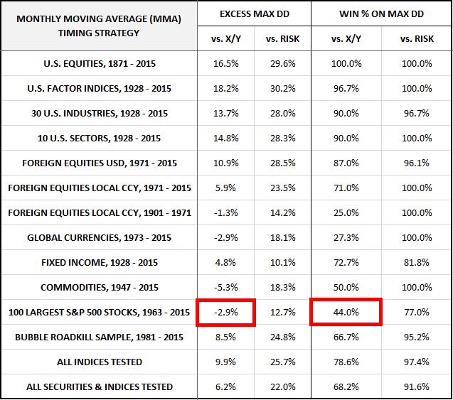
In each test, our focus will be on three performance measures: Annual Total Return (reward measure), Maximum Drawdown (risk measure), and the Sortino Ratio (reward-to-risk measure). We’re going to evaluate the strategy against the X/Y portfolio on each of these measures. If the strategy is adding genuine value through its timing, our expectation is that it will outperform on all of them.
For the three performance measures, we’re going to judge the strategy on its win percentage and its excess contribution. The term “win percentage” refers to the percentage of individual backtests in a category that the strategy outperforms on. We expect strong strategies to post win percentages above 50%. The terms “excess annual return”, “excess drawdown”, and “excess Sortino” refer to the raw numerical amounts that the strategy increases those measures by, relative to the X/Y portfolio and fully invested buy and hold. So, for example, if the strategy improves total return from 8% to 9%, improves drawdown from -50% to -25%, and increases the Sortino Ratio from 0.755 to 1.000, the excess annual return will be 1%, the excess drawdown will be +25%, and the excess Sortino will be 0.245. We will calculate the excess contribution of the strategy for a group of indices by averaging the excess contributions of each index in the group.
The Sortino Ratio, which will turn out to be the same number for both the X/Y portfolio and a fully invested buy and hold portfolio, will serve as the final arbiter of performance. If a strategy conclusively outperforms on the Sortino Ratio–meaning that it delivers both a positive excess Sortino Ratio, and a win percentage on the Sortino Ratio that is greater than 50%–then we will deliver a verdict of “Outperform.” Otherwise, we will deliver a verdict of “Underperform.”
Now, to the results:
(Note: if you have questions on how to read the charts and tables, or on how terms are defined conceptually or mathematically, click here for a guide.)
U.S. Equities, 1871 – 2015: The strategy was tested in U.S. equities across different date ranges and under different choices of safe assets (treasury bills, 10 year treasury notes, investment-grade corporate bonds, and gold). Verdict: Outperform. Click here and scroll down to see a slideshow of the charts and tables.
U.S. Size, Momentum, and Value Factor Indices, 1928 – 2015: The strategy was tested in 30 different U.S. factor indices–size, momentum, and value, each separated into 10 decile indices. Verdict: Outperform. Click here and scroll down to see a slideshow of the charts and tables.
30 U.S. Industries, 1928 – 2015: The strategy was tested in 30 different U.S. industry indices. Verdict: Outperform. Click here and scroll down to see a slideshow of the charts and tables.
10 U.S. Sectors, 1928 – 2015: The strategy was tested in 10 different U.S. sector indices. Verdict: Outperform. Click here and scroll down to see a slideshow of the charts and tables.
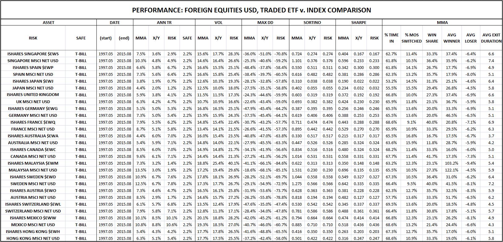
Foreign Equities in U.S. Dollar Terms, 1971 – 2015: The strategy was tested in 77 foreign country equity indices, quoted in U.S. dollar terms. A side test on popular Ishares country ETFs was included. Interestingly, the performance in the Ishares ETFs was worse than the performance in the country indices. Verdict: Outperform. Click here and scroll down to see a slideshow of the charts and tables.
Foreign Equities in Local Currency Terms, 1971 – 2015: The strategy was tested in 32 different foreign country equity indices, quoted in local currency terms. Verdict: Outperform. Click here and scroll down to see a slideshow of the charts and tables.
Foreign Equities in Local Currency Terms, 1901 – 1971: The strategy was tested in 8 different foreign country equity indices, quoted in local currency terms, going back to a much earlier period of history. Verdict: Outperform.
Global Currencies, 1973 – 2015: The strategy was tested in 22 global currency pairs. Verdict: Outperform. The strategy’s performance in currency was its strongest performance of all. Click here and scroll down to see a slideshow of the charts and tables.
Fixed Income, 1928 – 2015: The strategy was tested in 11 different fixed income indices. Verdict: Outperform. Click here and scroll down to see a slideshow of the charts and tables.
Commodities, 1947 – 2015: The strategy was tested in 2 different commodity indices–spot gold and spot oil. Testing in rolled futures contract indices was also conducted, but is not worth including, given the awful performance of a buy and hold strategy in these indices, particularly over the last 10 years, where the futures chains have spent most of their time in contango, inflicting negative roll yields. Verdict: Outperform. Click here and scroll down to see a slideshow of the charts and tables.
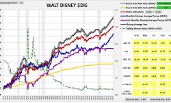
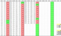
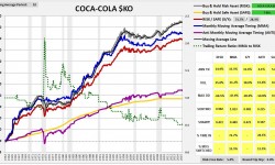
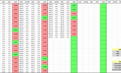
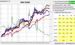
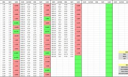
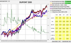
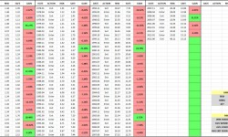
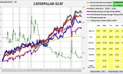
100 Largest S&P 500 Stocks, 1963 – 2015: The strategy was tested in the largest 100 S&P 500 stocks that have been continuously publicly traded for at least 20 years. In contrast to the other tests, the strategy’s performance in this test was terrible. Not only did the strategy fail to add any value, it actually subtracted value, producing significantly inferior return and risk numbers relative to the X/Y portfolio, despite taking on the same cumulative exposures. Verdict: Underperform. Click here and scroll down to see a slideshow of the charts and tables.
Bubble Roadkill Sample, 1981 – 2015: The strategy performed so poorly in the test on individual large company stocks that we decided to try and see if we could come up with a sample of individual company stocks in which the strategy did work. So we ran the strategy in the context of individual companies that have experienced large boom-bust cycles, and that are now nearly worthless, at least relative to their prior market capitalizations. Examples include notorious tech names that boomed in the 90s and busted at the turn of the century, notorious housing and finance names that boomed in the early-to-mid aughts and busted in the Global Financial Crisis, and notorious commodity names that boomed in the aughts and that are busting as we speak. The expectation was that the strategy’s performance in these names would improve significantly, given the opportunity to ride a boom and exit prior to a terminal bust. The results showed that the performance did, in fact, improve–but the improvement wasn’t as large as hoped for. The strategy strongly underperformed in a number of busted names–e.g., Freeport McMoran, Aeropostale, MBIA, and Q-Logic. Verdict: Outperform. Click here and scroll down to see a slideshow of the charts and tables.