We’ve added 28 new expert-built chart views to go alongside our existing 15 Snapshot charts, giving you 43 total pre-built visuals to analyze any stock faster and more effectively.
New categories include:
- Valuation vs. Peers
- Core Metrics
- Factor Ranks
- Company Metrics
- Dividend Metrics
- 3-Year History
- Technical Signals
- Macro Insights
Each chart is color-coded for quick interpretation:
![]() Green = higher is better (e.g. growth, profitability)
Green = higher is better (e.g. growth, profitability)
![]() Red = lower is better (e.g. valuation ratios)
Red = lower is better (e.g. valuation ratios)
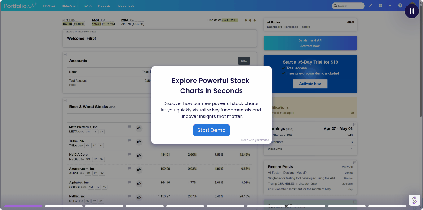
To help you get started, we created a short interactive demo with voiceover. It’s click-through and quick.
This quick demo shows how to access our expert-built charts (included in all plans) and get more value from your tools.
Let us know what you think about the new charts and the demo!