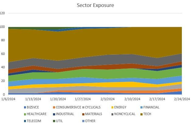
If we implemented this feature request, the historical holdings could be displayed in a stacked area chart like this example that I copied from some article a while ago.
Yes, that’s the type of chart I had in mind. I think it would be interesting, especially if it was an overlay of the return and/or the Draw down chart.
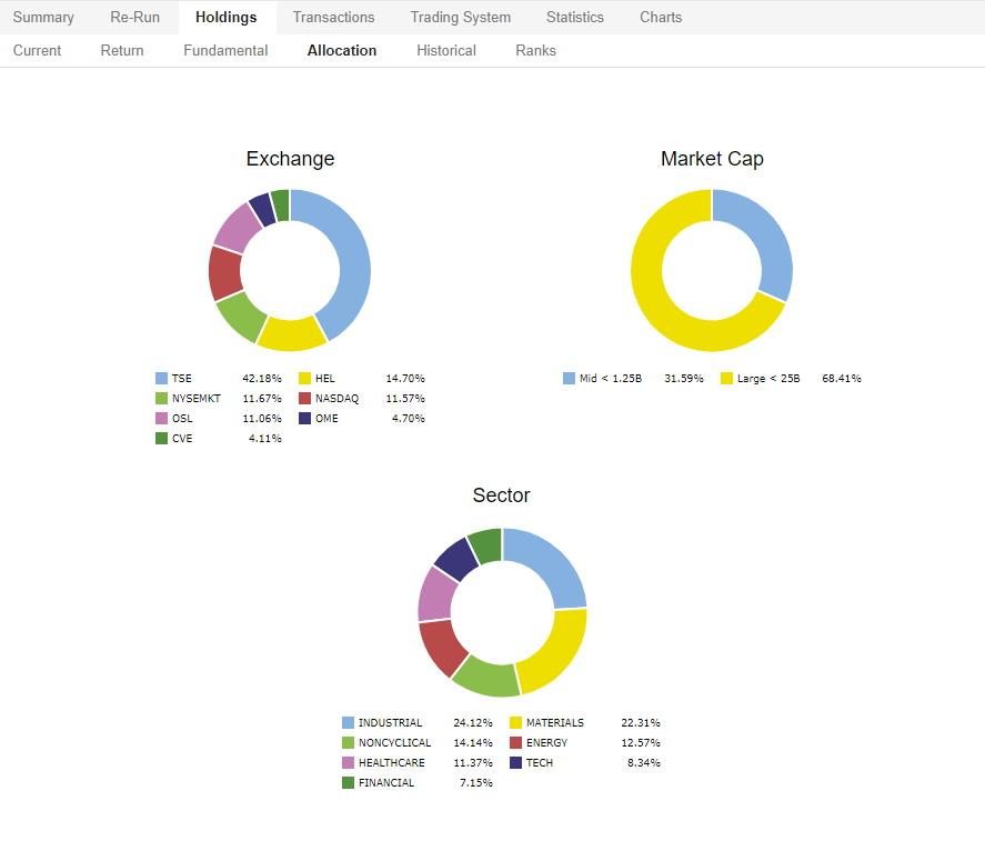
I want to add that the reason I'm looking for this is that I can tell from my live strategies that I have been underinvested in Tech for quite some time and uncomfortably heavy in materials/mining (which has been great recently).
The question I am trying to figure out is whether this is normal for my strategies, but I can't find a simple method to get an overview of the historical sector exposure.
If it turns out that I'm consistently underinvested in Tech, where there are normally great opportunities, maybe I should dig deeper to adjust that. Or perhaps, when the strategies find value in mining, we are entering a new market regime, which might also provide valuable information.
Agree that this would be useful and interesting to see. More of a nice to have than something essential.
Subsector would be nice as well. I appreciate there would be a lot of different categories but it would show if weighting in one subsector was very high which would be useful.
I agree, this would be very useful. I imagine this would be a low resource project - you already calculate latest sector weights so it would just need to be done at each rebalance as well.
The attached spreadsheet shows the counts by sector over time for your strategy. There is also a sheet that shows Country exposure over time. The samples are 2 of the P123 live strategies. Just paste the realized transactions from your live or simulated Strategy into the sheet.