Please tweak the ranking system charts to make it much more useful:
In descending order of importance:
- Plot a range of returns with std bars or a box plot.
- Median average returns.
- Rolling periods.
- Alpha instead of raw returns.
- Benchmark should be the average (equal weighted).
- Benchmark should be limited to the universe.
1 - Why std bars?
Because statistically, the greater the magnitude of the out-performance, and the more consistent it is, the more likely it is that it’s not a fluke.
Magnitude is returns. So that’s already on the chart. But consistency is still missing from the chart. Std is one measure of consistency.
Here is jlittleton’s chart which illustrates a way of plotting std:
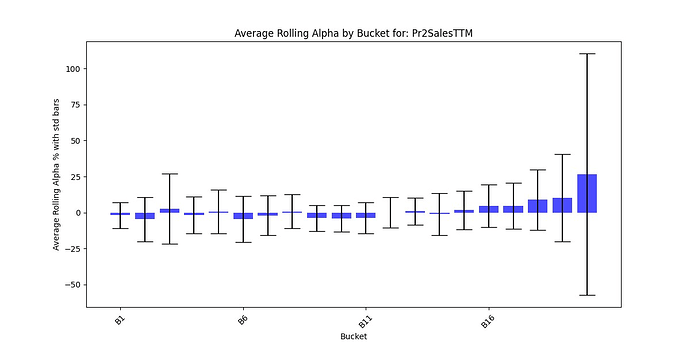
Alternatively, a box pot, (also known as a box and whiskers diagram), might be an even more useful way to see the consistency of returns for each bucket at a glance.
Generic box plot (from Wikipedia):

Notice the red line? That could be the benchmark.
2 - Why medians? Because medians are less prone to outliers than averages. .
3 - Rolling periods incorporate more data.
For example, when the re-balance period is one year, a ten year back-test only incorporates ten periods.
If you would have a rolling back-test every week, even if the holding period is one year, it would incorporate many more data points and would show and greater signal to noise ratio.
4 - Why alpha?
There is more signal and less noise in alpha vs. raw returns.
True, you can’t eat relative returns. It’s absolute returns that matter.
Yet, when designing a ranking system you are measuring how well the system is able to pick better stocks from worse stocks. That’s why the same raw returns mean very different things depending on what the market did. If your top ranked stocks were up 20%, is that a good result or not? It depends. What did the average stock do during that same period? If the average was down -50% and your top ranked bucket was up 20% then it did fantastic! But if the market was up 75% during the same period, then being up 20% is not as good, is it?
Instead of alpha, alternatively, you can draw a horizontal line across the chart showing what the benchmark did during the same period, sort of like the red line on the generic box plot above.
5 - The benchmark should be the equal weight returns of the tested universe; not the cap weighted returns of some somewhat arbitrary subset of the market.
Again, the equal weight benchmark has a higher signal to noise ratio than market cap weights.
Please vote for this feature request! Let’s make the ranking system charts much more useful!
.