Steve,
No worries, I appreciate your feedback. I’m not sure what you don’t understand exactly, so just ask if this post doesn’t answer all your questions.
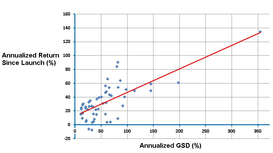
The scatter plots show the relation between annualized excess return since Launch (labeled Ann Excess Launch on all charts) versus another variable of interest. Each point on a scatter plot is one R2G model. Let’s take the outlier that is clearly visible on all charts in the upper right corner. This model has Ann Excess Launch of close to 120 percentage points. On the Y axis you can see how this model scores on a given variable, for example it had a GSD of around 0.45 (% per day) and an Annualized GSD of over 400 (% per year). The histograms to the left and on the bottom show how many models fall into a certain range of values, but that’s not important here.
The red lines in the scatter plots show the best linear relationship (trend line / regression line). You can easily create these plots in Excel yourself. Just select two columns, insert a scatter plot (XY chart), and add a linear trend line. Please note that the red lines in the scatter plots have different slopes and intercepts. The slope of the red line is also not necessarily exactly 1. It’s simply the best linear approximation of the relationship between the two variables.
Now, the reason for doing this is to see whether there is a systematic and relevant relationship at all. If there is no meaningful relationship at all, then the points in the scatter plot would all over the chart and you wouldn’t see a pattern at all. You can try to make a scatter plot of some variables I listed under “No longer significant according to a t-test” against Ann Excess Launch to see what I mean. (Nevermind the word t-test or R2 value.)
If there would be a perfect linear relationship, then all the blue circles in the scatter plot would be exactly on the red line. The more dispersed the blue circles are, the less clear the relationship is (up to non-existent if the points are scattered all over the chart). So the red line helps to see how strong the relationship is, by judging the distance from the blue circles to the red line.
So in essence I charted all variables I listed against Ann Excess Launch and judged the ‘fit’. Well, I didn’t actually do that manually, but I ran a script that computed the R-squared and t-test for each combination, and those values can be used to interpret the fit. Higher values of R2 mean that there is less dispersion around the red line, whatever that red line would be for that particular combination of variables.
In fact, you can do this for any number of variables against Ann Excess Launch. See http://en.wikipedia.org/wiki/Linear_regression. I tried it for combinations of up to two variables against Ann Excess Launch. The R2 is highest when you use AvgReturn*Turnover and LOG(Holdings) as the two variables. This means that those two variables are best for explaining the Ann Excess Launch based on the data we have about R2G models in this particular period, and, if the relationship will persist in the future, then it’s also the best prediction of future performance. This is a big if. (And besides, linear regression makes a number of assumptions which may or may not hold).
The exact formula I used to calculate Annualized GSD is (((1.0 + GSD / 100.0) ^ 365) - 1.0) * 100.0. GSD itself is simply Average Return / Average Days Held. Target Holdings is round(Holdings / %Invested * 100.0). AvgReturn div Turnover is Average Return * (Turnover / 100.0) / 365.0 (note that it actually multiplies by Turnover, despite what the variable name says). LOG(Target Holdings) is the natural logarithm of Target Holdings.
My “prediction” formula, labeled as PREDICTED_OOS_RETURN in the scatter plot in my first post and by ANN_EXCESS_PREDICTION in the other post with scatter plots, is the result of the linear regression of AvgReturn*Turnover and LOG(Holdings) on Ann Excess Launch (the difference between the two is only the use of LOG(Holdings) vs LOG(Target Holdings)). The exact formula I used for ANN_EXCESS_PREDICTION is -34 + 287.3388 * Average Return * (Turnover / 100.0) / 365.0 + 8.0035 * LOG(Target Holdings). Those numbers were found by the regression.
If you create an additional column in the CSV file with that formula, then you can make a scatter plot in Excel with Ann Excess Launch versus that new column. That will give you the same scatter plot as the lower right one in my previous post.
I don’t know how to do linear regression in an easy way in Excel. And it should be used with care, because it’s easy to misinterpret results. When you just want to regress one variable on another, it’s easiest just to make a scatter plot and try to look for a relationship. You can add a trend line, and I think there’s also on option to see the formula for the trend line somewhere.
Hope this helps.
-Peter