Victor,
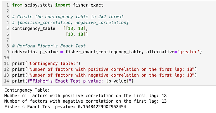
Edit: I question the significance of just these 2 factors due to the multiple-comparison problem with 40 data points (i.e., none would be significant with the Bonferroni correction). But if you tested 20 different factors and found that all or most had positive correlation for the first few weeks that would be interesting, I think. Maybe use a Fisher's Exact test on 20 factors (categories being 'positively correlated first week' or 'negatively correlated first week'). Just a thought of something that could be looked into. But not enough data in my post for any conclusions, IMHO.
Thank you for that reference. I always like to take the methods of papers and use them with P123 data.
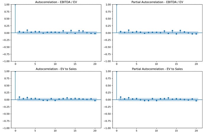
This is the autocorrelation of the excess returns of the top bucket (30 buckets, 2000 - 2024 weekly excess returns relative to the easy to trade universe) for the factors in the screenshot. I leave it to each members to form their own conclusions or test it themselves with their own factors:
Just for those who wish to check my code (or use it). Corrections welcome:
import pandas as pd
import matplotlib.pyplot as plt
from statsmodels.graphics.tsaplots import plot_acf, plot_pacf
(#) Specify the file path (replace with your actual file path)
file_path = '/Users/your_username/Desktop/autocorrelation.csv'
(#) Read the CSV file into a DataFrame
df = pd.read_csv(file_path)
(#) Convert the 'Period' column to datetime and set it as the index
df['Period'] = pd.to_datetime(df['Period'])
df = df.set_index('Period')
(#) Plot autocorrelation and partial autocorrelation with significance bands
fig, axes = plt.subplots(2, 2, figsize=(12, 8))
plot_acf(df['EBITDA / EV'], lags=20, ax=axes[0, 0], alpha=0.05)
axes[0, 0].set_title('Autocorrelation - EBITDA / EV')
plot_pacf(df['EBITDA / EV'], lags=20, ax=axes[0, 1], alpha=0.05)
axes[0, 1].set_title('Partial Autocorrelation - EBITDA / EV')
plot_acf(df['EV to Sales'], lags=20, ax=axes[1, 0], alpha=0.05)
axes[1, 0].set_title('Autocorrelation - EV to Sales')
plot_pacf(df['EV to Sales'], lags=20, ax=axes[1, 1], alpha=0.05)
axes[1, 1].set_title('Partial Autocorrelation - EV to Sales')
plt.tight_layout()
plt.show()
Jim

