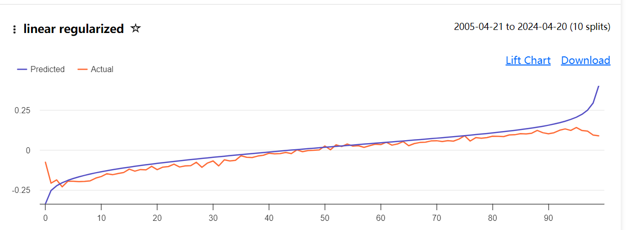
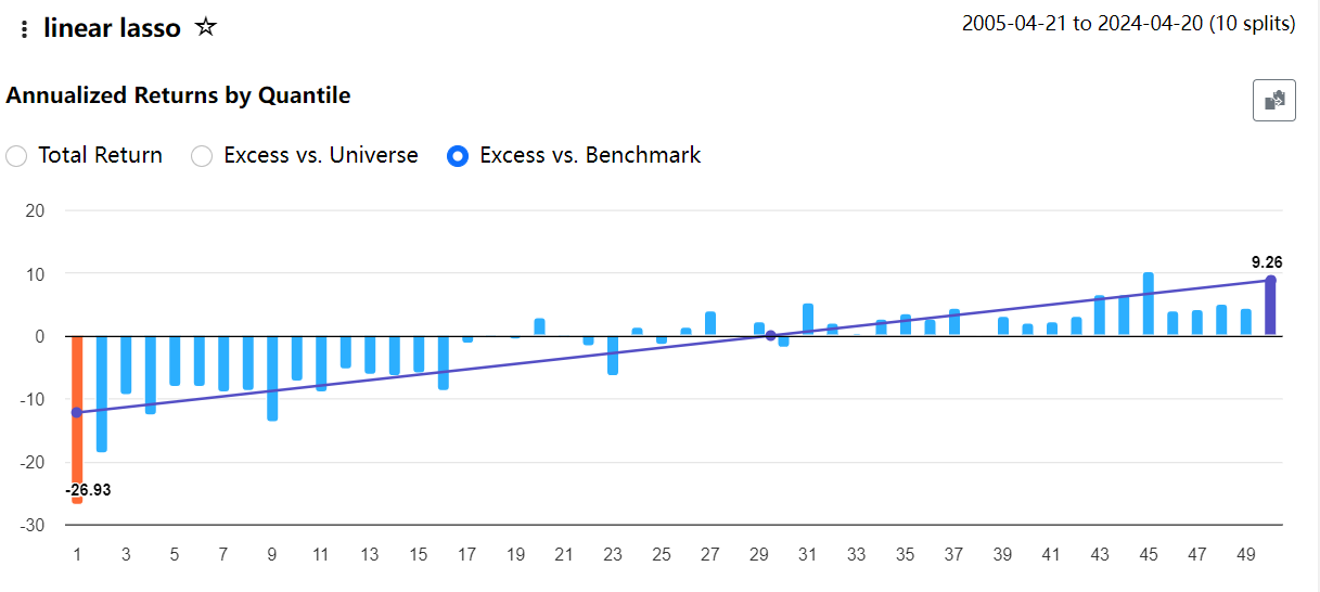
Looks like it almost perfectly predicts the target: 12 month excess returns from the benchmark.
I understand that since the "frequency" of the "dataset" is set to "Every week", the "Portfolio" sub tab within the "Results" tab will not match up to the holding period of my target "12MTotRet". Here is that result:
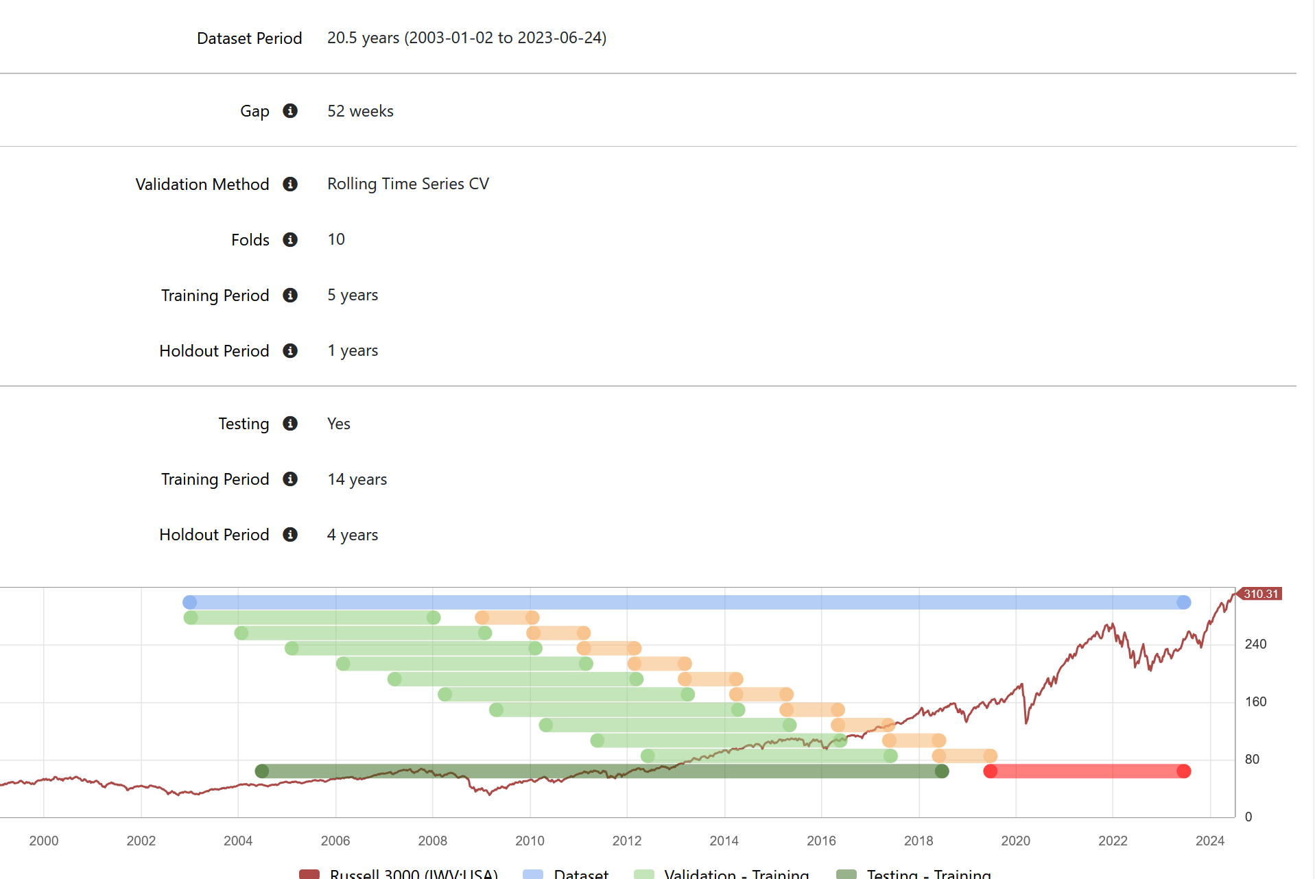
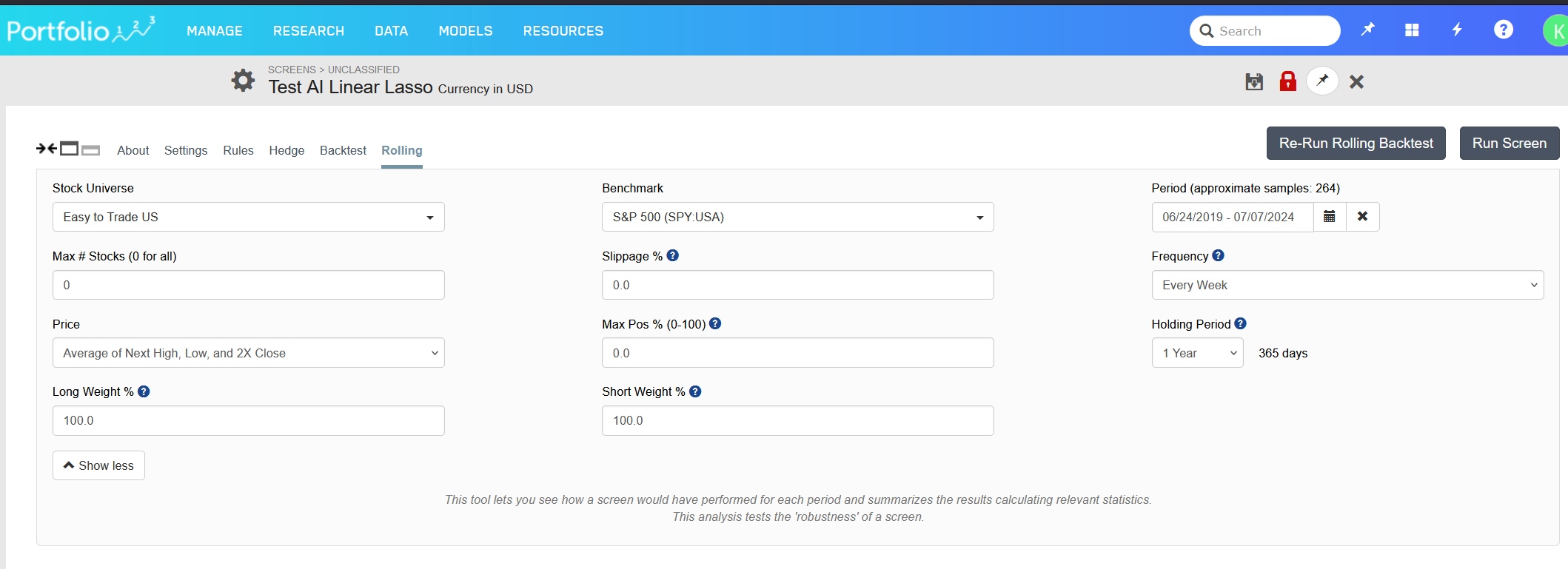
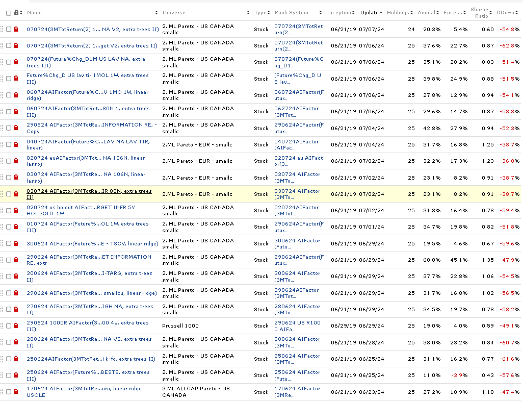
Lots of info missing. What was the training period of the predictor? What rules were used in the screen? What are all the settings for the rolling screen?
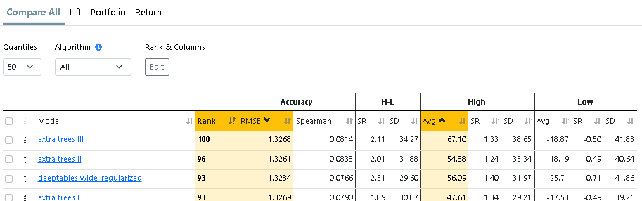
Reconciling a lift chart with a screen is impossible. Your lift chart looks great in the testing period, but all you are seeing is the average normalized actuals vs predictions. You are not seeing the volatility, and there's lots of it (we tried different ways to convey the volatility but it just made the chart unreadable). A good lift chart is certainly better than a bad one, but a good lift chart is not a guarantee that it produces great portfolios.
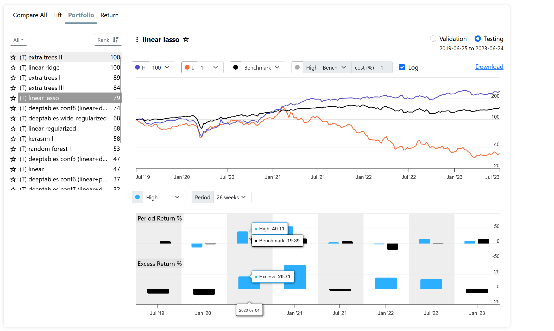
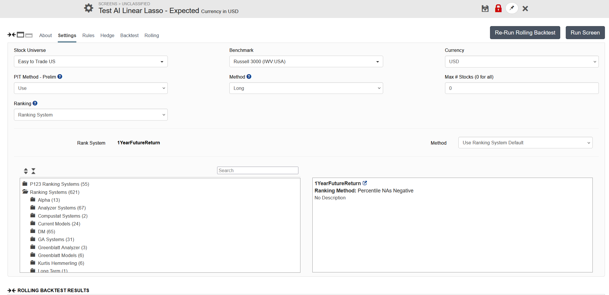
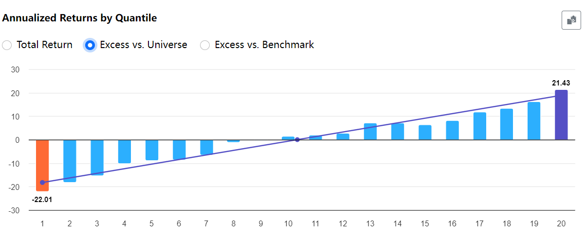
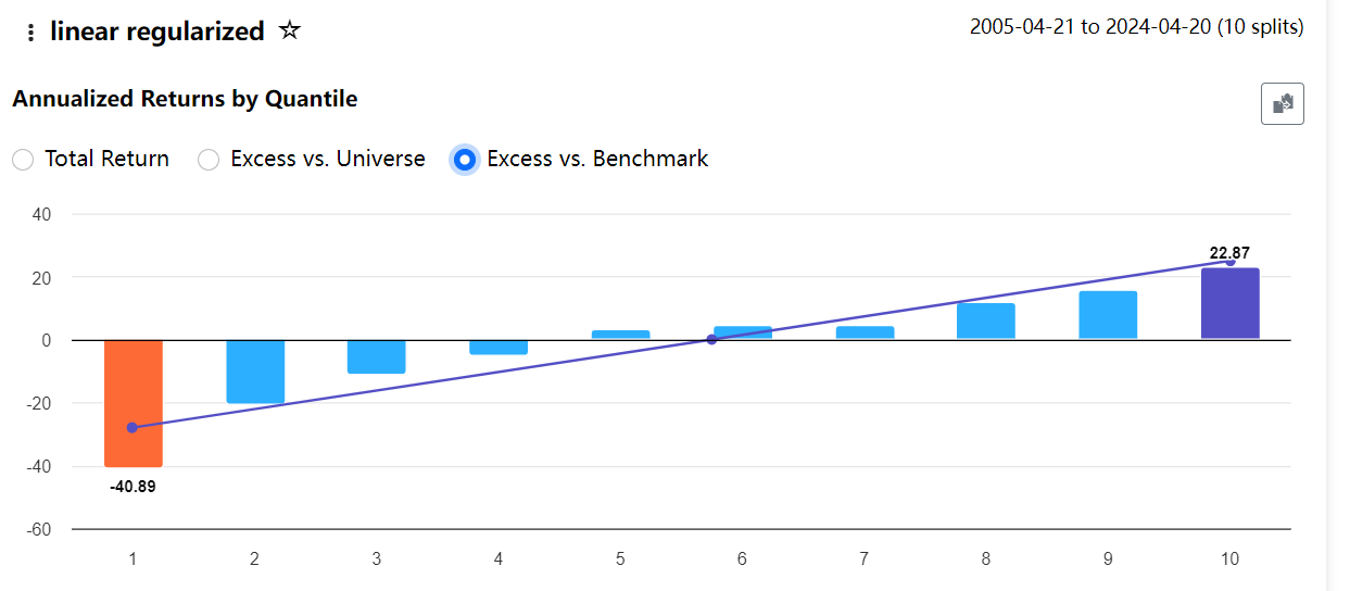
So the first thing to do is reproduce the quantile portfolios of AI Factor, which should be reproducible with high accuracy. For the charts below I used a screen backtest and a ranking system with a single factor, the predictor. They are in your account, both called 'testing'.
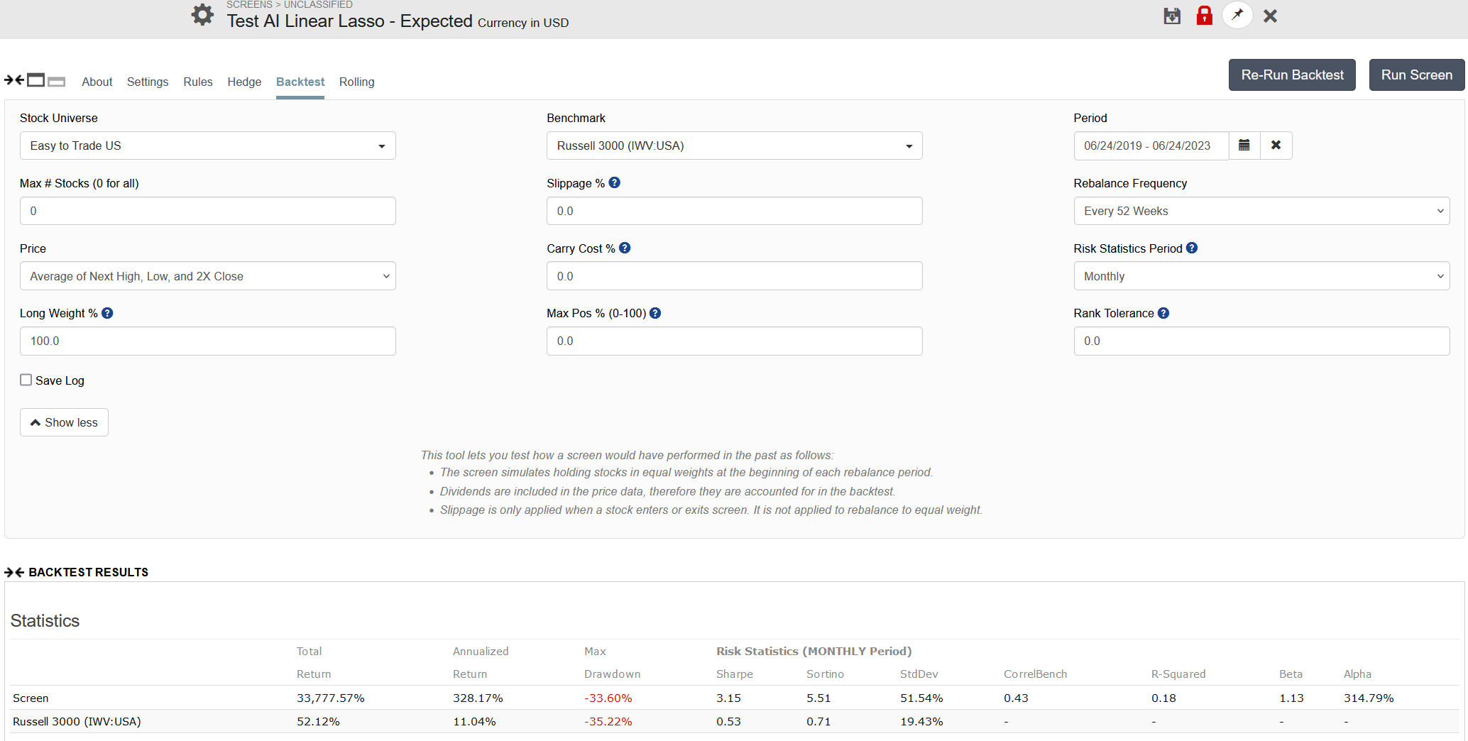
Below please find the results which reproduce the portfolio quantiles from AI Factor with a screen backtest. They are very, very close, so all seems to be working properly.
Lastly, your second test using a ranking system with a single look ahead factor is not correct. You are ranking stocks looking into the future. That's not what AI factor is doing.
Let me know what u think.
Thanks
NOTE: to reproduce the lowest bucket you must use this setting: Ranking Method = Percentile NA Neutral.
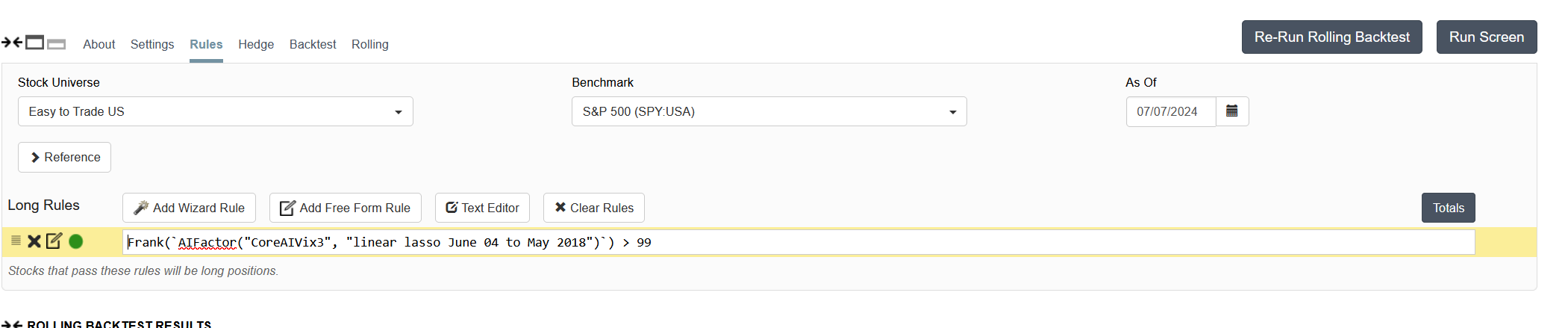
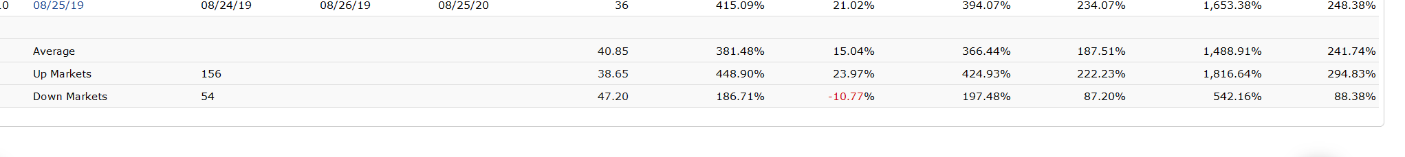
I ran the rolling test in your account using the screen 'testing' with a single rule 'Rank > 99' , with the ranking system that uses the predictor, and I get the following
The excess column is highlighted and is all positive. Perhaps you ran it using the wrong rule? Also beware that these are averages of 200+ weekly 1Y rolling screens. The returns are quite volatile.
And here's the rolling test Rank<1, so the worst quantile, showing all -ve excess returns. But again, lots of volatility, with some samples having very high +ve excess, like 100%+.
My initial screen likely used a different universe or holding period. My second screen, however, appears correct and aligns with your posts.
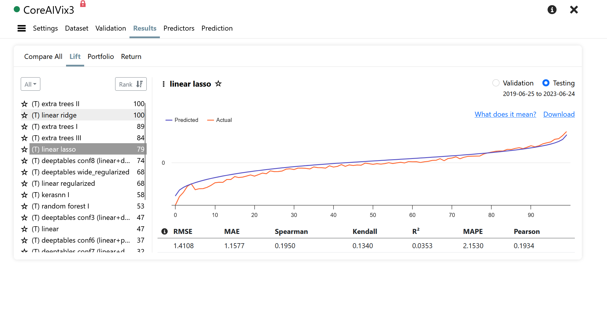
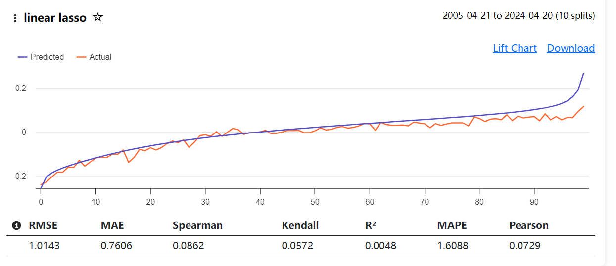
My main issue is that I don't understand how the lift chart is being computed. Is there any documentation available for this? This uncertainty led me to run the screen using the top-ranked stocks by future return as the target. When I saw an accurate chart showing predictions matching actual returns (normalized, but that's irrelevant), I assumed the model was accurately predicting future returns for the top bucket (or any bucket).
I initially tested the AI factor product by training and running the predictor on in-sample data. My short tests indicated that the models were correctly identifying the top returning stocks with accuracy. But when I see OOS lift chart looks like an IS results, I had to dig a little deeper.
Can you clarify how the lift chart is calculated and what it represents? I found these two things:
"Lift Chart: A lift chart compares the predicted performance of your AI Factor to the actual outcomes using the model's predictions against the data from the holdout period."
" The chart features two lines:
Red Line: Represents the actual outcomes of the target variable, for example the average excess return of a set of stocks.
Blue Line: Indicates the model's predictions for those same outcomes."
I don't understand how volatility could negatively affect the rolling return average but not the lift chart average. Both compute returns from day 1 to day t+365 (in my case) and average those returns. Then, it averages over all those samples. I suspect there might be another factor at play.
First of all targets and actuals get normalized, so outliers are not as significant. Not so with portfolio returns.
Second the lift chart is not time dependent. A string of bad results followed by a string of good results has the same average as alternating good & bad results. But the former is much worse in a portfolio. Losing 50% twice in a row then gaining 50% twice in a row results in a -44% return, but the average is 0% return.
Outliers should offset each other (i.e., no bias). But are you saying that's not the case? Is so, we are trimming outliers in the highest bucket during modeling, and we should see screens shower higher returns, not lower, no? (We removed outliers in the lift chart but not in the simulations, which should boost the results.) Regardless, the lift chart is showing the top returns of the universe (normalized data still ranks the highest returns correctly) being accurately predicted. Maybe a raw data example could clarify this?
I agree, which is why I used the screener to remove the time dependency, right? I understand the time dependency issue as it related to volatility (it drags returns down), but I'm struggling with this because rolling screens do not compound returns. It's a sum product of x returns with y starting weights for each rolling period. Then we average all of those. What am I missing? Apologies for being obtuse.
Use case for lift charts: When predictions of the actual returns are made available it will be nice to know how much bias there is in the predictions. Especially, if predictions of returns are added to estimates of transactional costs, by the member, to determine whenever to buy, hold or sell an asset.. Plus, why not add bias estimates to the variance estimates as part of a basic understanding of a model just for completeness, if nothing else?
Wow. I don't even have to add a feature request for this. Nice work on this P123!!!!!
To me it looks like the lift chart provides many of the usual metrics of machine learning such as RMSE, MAE, R^2 etc. P123 adds to this with a lift chart.
What I think the lift chart adds to this is that it shows any bias of the results. In Korr's first post, that I will not duplicate here, the predictions seem to be biased to more favorable predictions to the left and biased to lower predictions (compared to the actuals) at the far right.
As an aside, this seems to be some sort of kernel regression with some smoothing. Like a LOESS regression or someting.
TL;DR: Seems like the lift chart might be an addition to the standard machine learning metrics. An addition with the purpose of showing any bias. And it might be serving its intended purpose.
A nice addition if Korr verifies the numbers (accounting for the smoothing of a Kernel regression) are correct. I have no opinion on that. I'm not going to run the numbers my elf and I default to the idea that Marco probably got it about right for now.
Addendum. I checked my post for accuracy and got one correction. Claude 3 does not think the lift chart shows very much bias. A good thing if you think about it.
" Lift Chart Purpose: Your interpretation that the lift chart is meant to show bias in the predictions is insightful. The chart compares predicted values (blue line) to actual values (red line), allowing visualization of where the model over- or under-predicts.
Bias Visualization: While you mention bias to the left and right in Korr's first post, this particular chart doesn't show significant bias at the extremes. The predicted and actual lines follow each other quite closely throughout the range.
Smoothing: Your observation about smoothing is astute. The lines do appear smoothed, which could indeed be a result of some form of kernel regression or LOESS-like technique."
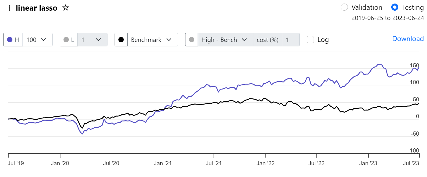
This isn't really about the lift chart, but I also haven't been able to replicate (or even come reasonably close to) the results of test models. Am I doing something wrong or missing some step in the process?
"I also look forward to seeing more responses, because I agree, I am facing significant challenges in achieving results close to the ML-results whether I run the test OUS in Screen backtest or simulator backtest.
Below is a post I sent to some users on the P123 platform to air my frustration but also to investigate if there is something I am doing wrong.
Anyway, I hope more people can provide input on how to convert the results we get in the ML section to various OUS tests."
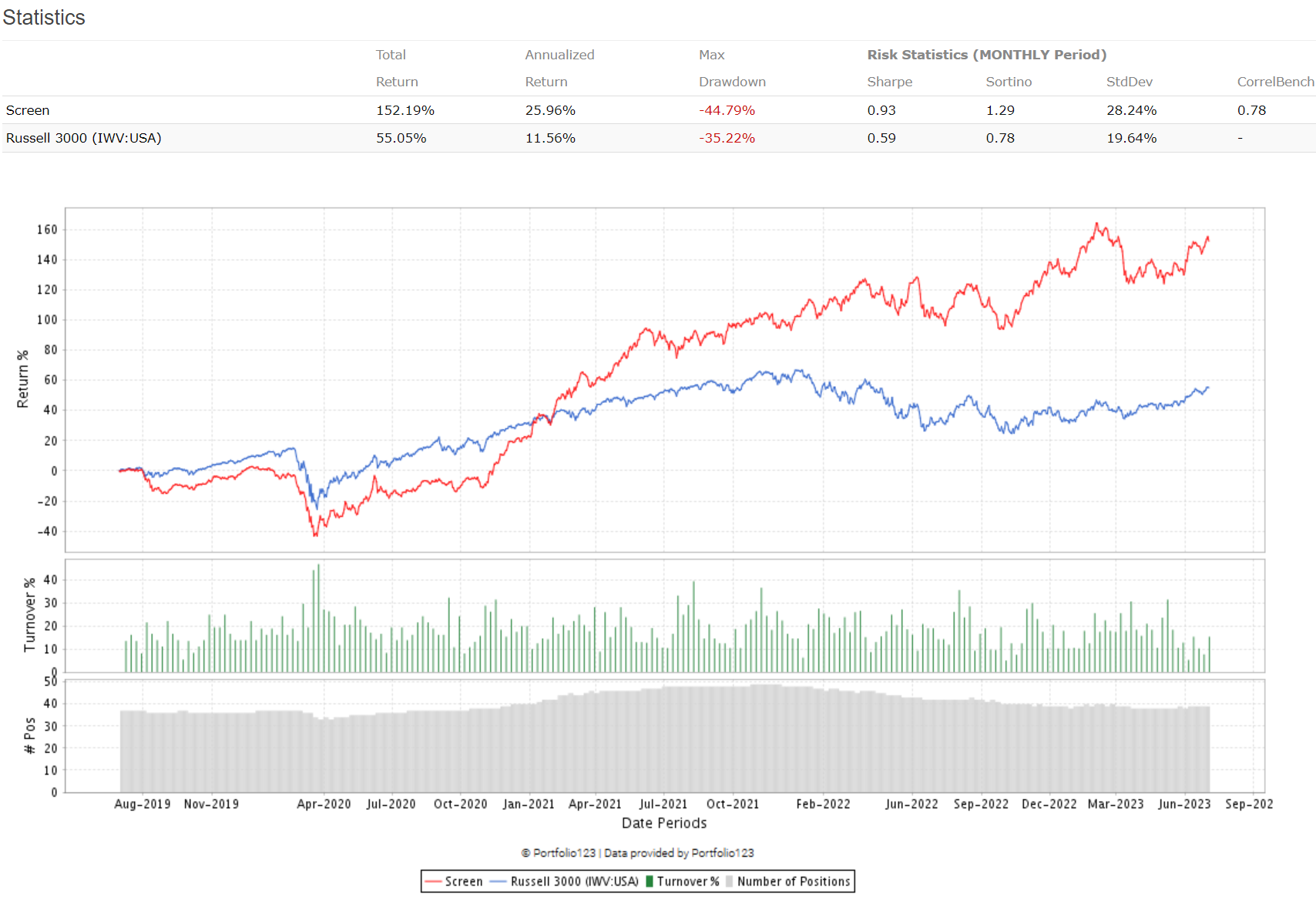
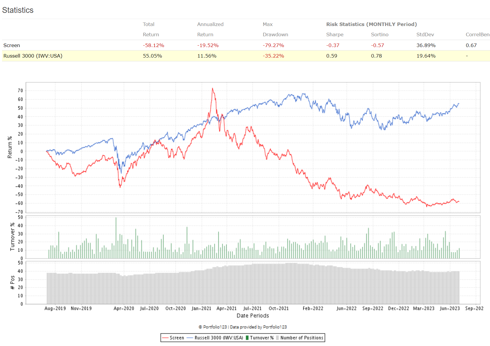
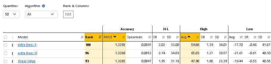
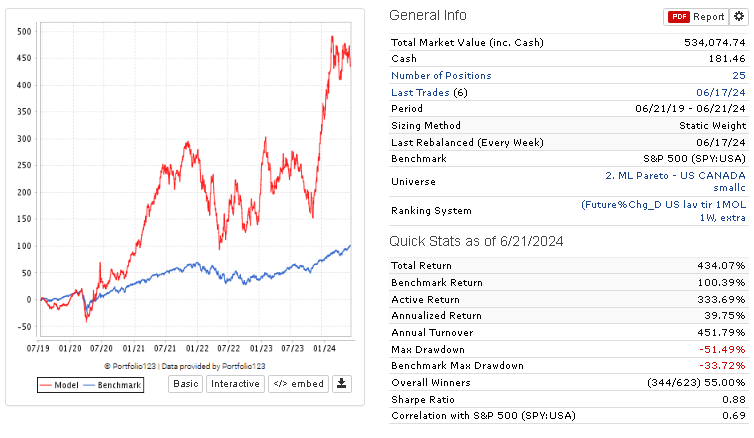
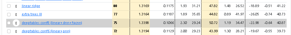
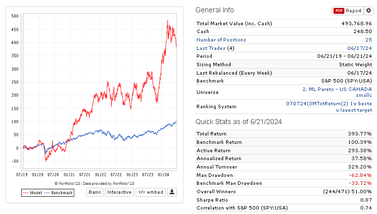
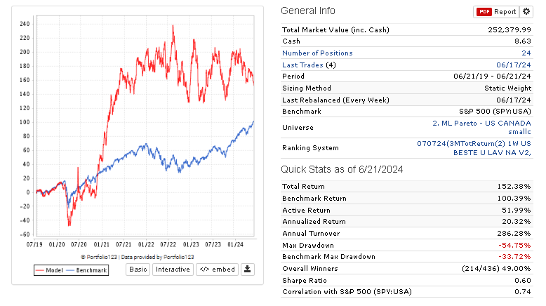
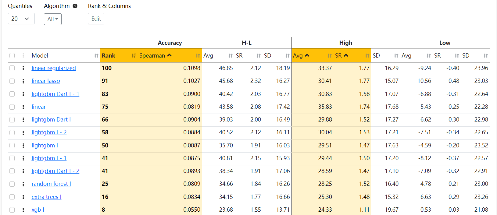
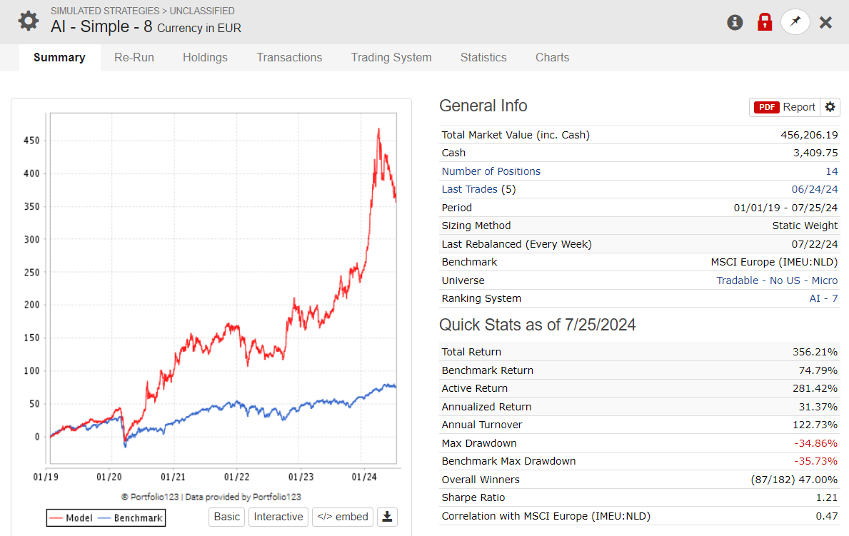
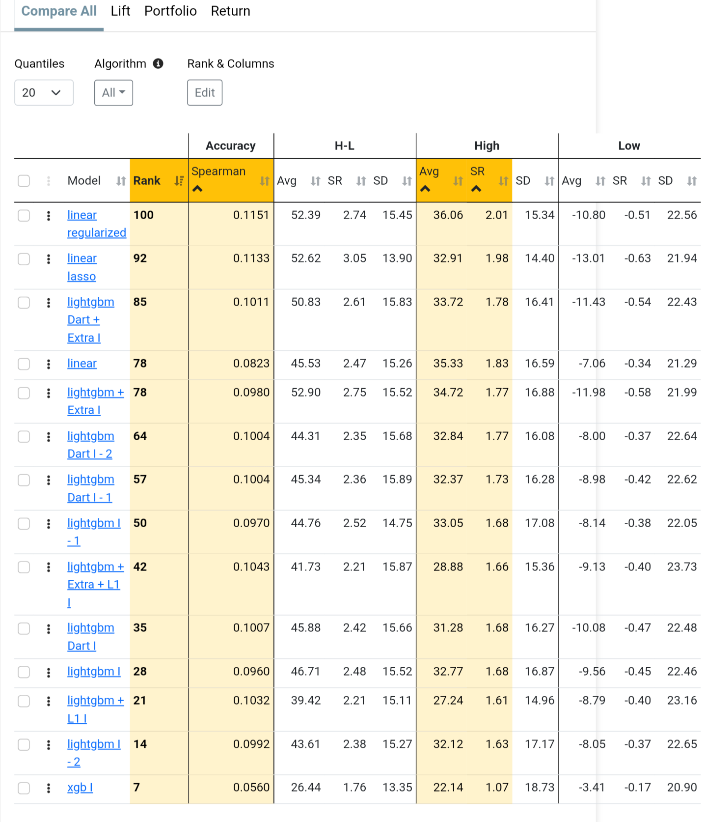
I have run all possible tests and achieved good returns in the ML model (AVG. 65% to 59 in Quantile 50 (35 stocks in each) ) , but for some reason, in the simulator backtest OUS, I get very different results.
I don't understand what I'm doing wrong, but I am not impressed with the OUS results. Some are good and reach up to 50% annualized in my OUS from 2020-2024, but they are often very volatile. The reason for the good returns is either because I optimize turnover or rebalance frequency, and also, the returns are boosted by a large spike in returns in 2023.
In summary, the models show that:
I end up with many industries I wouldn't normally invest in
Returns are extremely variable
In the models with best returns, the volatility is often high
I can improve results by adjusting turnover or rebalancing frequency
I simply wonder what I am doing wrong in the simulator since the OUS results are so unique. Or do you have any recommendations?
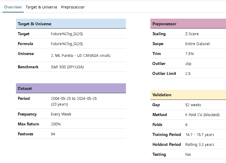
In the ML-AI factor, I have:
I tried different universes
Different numbers and types of features
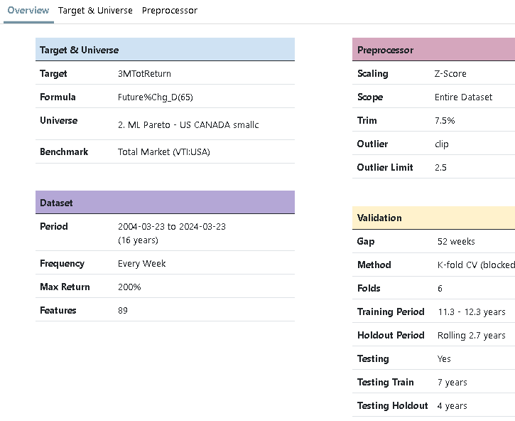
Different target periods range from 3 months to 1 month
Frequency: from 1 week to 4 weeks
Always use a 52-week gap
Tested K-fold, Time Series CV, and rolling Time Series CV
I have removed features with high NA or low Target Information Regression
Can anyone share models that effectively reconcile the AI Factor results (testing/validating/lift charts) with simulations? I feel like I, with others, might be missing something.
However, I am limited by the maximum number of features. Otherwise, I could have added more historical data of various kinds: short interest, price target, analyst expectations and some other raw data in sign and absolute value that could be negative so I didn't use it before. The shorting interest and analyst expectations data have been added, but not nearly enough of them.
Currency exchange rate data and its history may be able to be added to avoid too many Turkish stocks and to capitalize on the effect of exchange rate changes on expected stock returns. Adding more detailed industry characteristics as well as adding country of incorporation characteristics/exchange characteristics/stock nature characteristics (e.g., company event, whether it is ADR, whether it is OTC, whether it is MLP) may also be useful. However, these were discarded because of the cap on the number of features.
This suggests that even the simplest machine learning algorithms (like OLS, LASSO or ENet) can automatically find okay (but maybe not very good) patterns from the raw data, and you only need perform normalization to process the raw data into a distribution close to a normal distribution (e.g., removing negatives and zeros and then solving for the logarithms), without much feature engineering as in finance. I think this is exactly what machine learning algorithms were designed for.


