I'm no expert, but I have been testing extensively since the beta release.
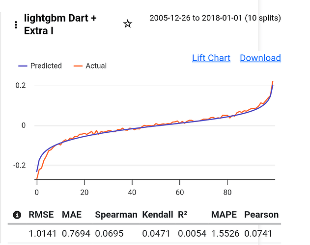
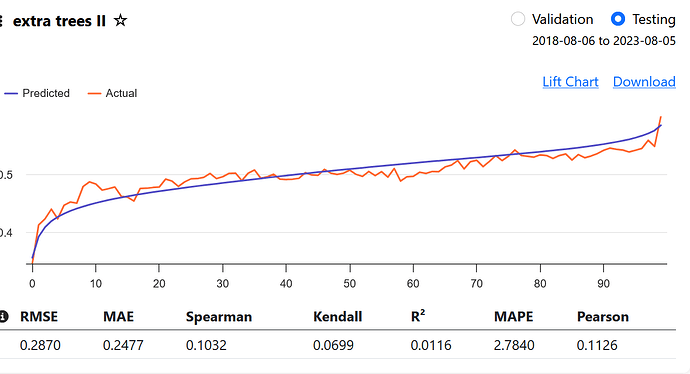
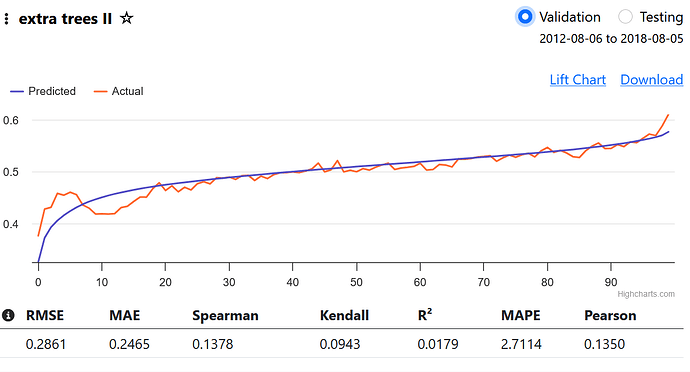
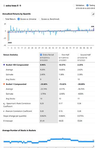
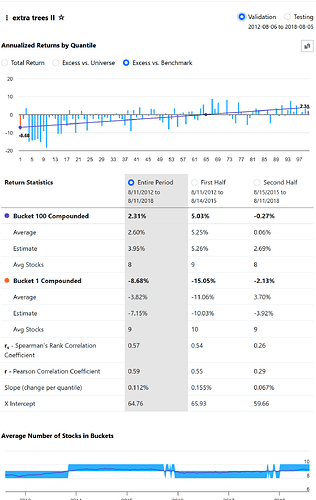
From what I understand, a beautiful lift chart is not directly correlated with the Performance Quantile chart. If you create a model that predicts an awful, non-linear performance chart, and the chart you get from the validated test is just as bad as the prediction, the lift chart will look good because the prediction and validation match.
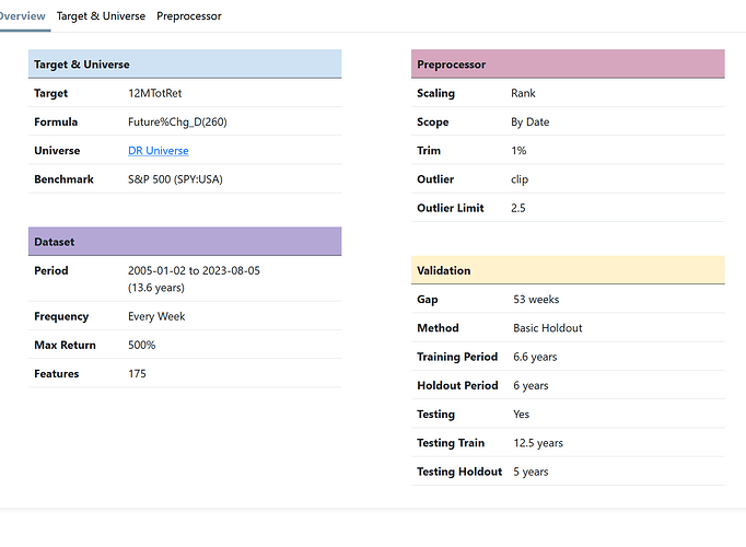
Trimming more than 1%—around 5 to 7.5%—has worked well for me. It seems that the algorithms tend to focus on outliers if you don't trim.
With a "Max return" of 500%, you'll get a lot of noise in the Performance chart, especially if you use 100 bars. A standard of 200% or less gives a better chart. In my opinion, 10 to 20 bars are more than enough to see the performance.
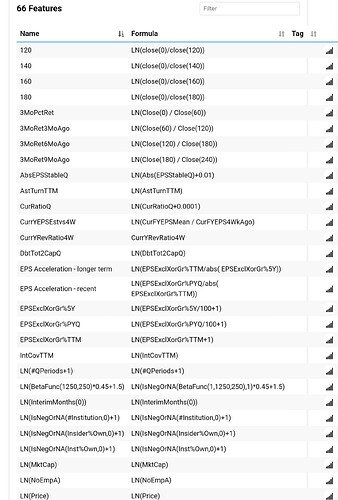
Your target and features should somewhat match. Looking at 1-year returns but analyzing quarter-to-quarter fundamental performance will create a lot of noise. From what I’ve seen, 1-month targets will give a very nice performance chart but won’t yield reliable simulated results. Twelve months is too much to find high alpha.
The algorithms always "downgrade" volatility features unless your target has some volatility characteristics like Sharpe or something similar.
If you're analyzing European stocks, try different currencies—you might end up just analyzing the relationship between currencies, not the performance of the actual feature.
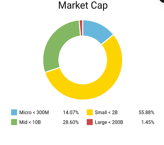
I haven't found any algorithm that manages to use Market Cap as a catalyst. Instead, add a few percent of Market Cap as a factor in your final ranking system.
I've noticed that there's an advantage to training the model on a slightly larger universe than you intend to use in your final simulation.
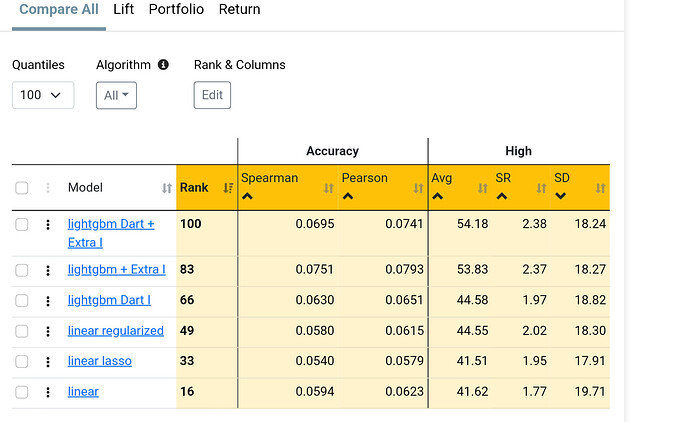
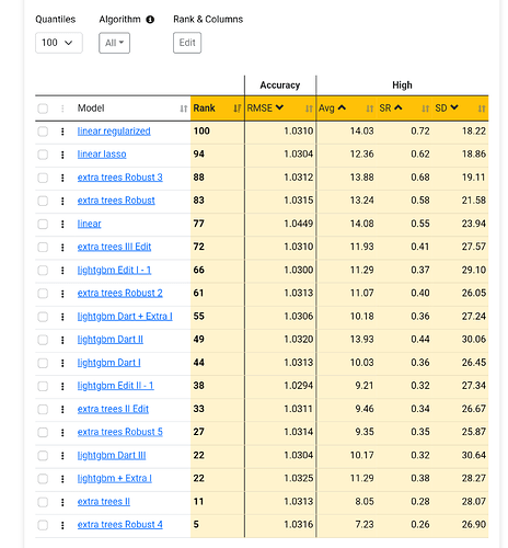
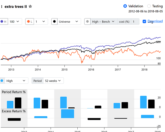
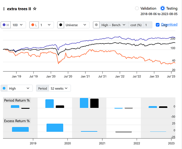
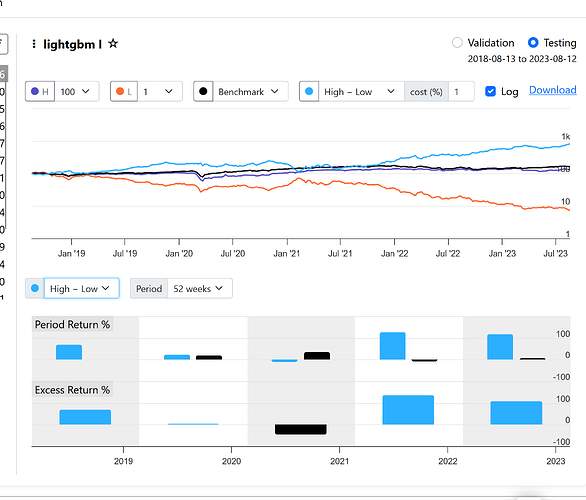
If you get great validated results with non-linear models but the results from linear models are poor, it's very likely that the simulated results will also be poor (just an observation).
More features aren’t always better; it seems that common sense still applies in machine learning.
