I found some things about this threat interesting: My factors have been underperforming badly the past month and a half. I did not want to hijack the thread with too much ML or by being too focused on what may interest me alone.
But maybe you will agree that this is interesting for those of us using small-cap models that have been underperforming recently.
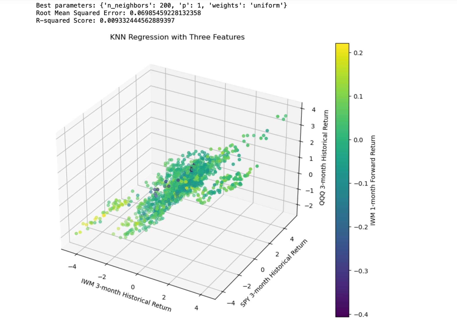
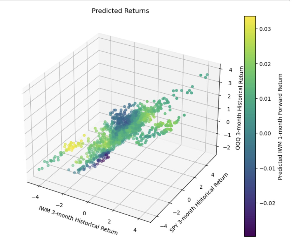
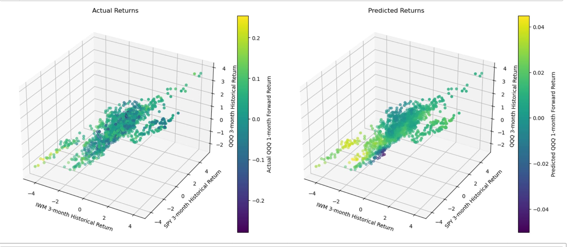
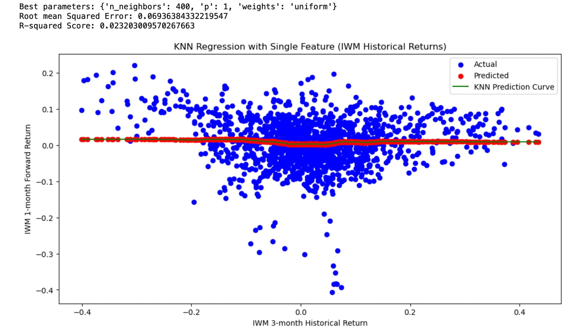
Maybe IWM reverts to the mean. And maybe this data does suggest mean-reversion with some ability to predict returns using regression models (KNN here):
ML Model: KNeighborsClassifier
The data is daily adjusted close of IWM downloaded from Yahoo. com. I think I took care to remove any data leakage. Specifically, by using next close for the start of future returns and purging the train/test split but would very much appreciate any corrections to my code:
from sklearn.model_selection import TimeSeriesSplit
import pandas as pd
import numpy as np
from sklearn.model_selection import GridSearchCV
from sklearn.neighbors import KNeighborsRegressor
from sklearn.metrics import root_mean_squared_error, r2_score
import matplotlib.pyplot as plt

# Load and preprocess the data
data = pd.read_csv('~/Desktop/knn.csv', parse_dates=['Date'])
data.set_index('Date', inplace=True)

# Calculate 3-month historical returns
historical_returns = data['IWM'].pct_change(periods=60)  # Assuming 60 trading days in 3 months

# Calculate 1-month forward returns using next close to avoid data leakage and make it tradable.
forward_returns = (data['IWM'].shift(-21) / data['IWM'].shift(-1)) - 1

# Combine into a DataFrame
df = pd.DataFrame({
    'historical_returns': historical_returns,
    'forward_returns': forward_returns
})

# Remove any rows with NaN values
df = df.dropna()

# Sort by date to ensure chronological order
df = df.sort_index()

# Define the split point (e.g., 75% train, 20% test, 5% purge)
train_end = int(len(df) * 0.75)
test_start = train_end + 21  # 21 trading days purge period

# Split the data
X_train = df['historical_returns'].iloc[:train_end].values.reshape(-1, 1)
y_train = df['forward_returns'].iloc[:train_end].values

X_test = df['historical_returns'].iloc[test_start:].values.reshape(-1, 1)
y_test = df['forward_returns'].iloc[test_start:].values

# Define the parameter grid
param_grid = {
    'n_neighbors': [200, 300,350, 400, 450, 500],
    'weights': ['uniform', 'distance'],
    'p': [1, 2]  # 1 for manhattan_distance, 2 for euclidean_distance
}

# Create the GridSearchCV object
#grid_search = GridSearchCV(KNeighborsRegressor(n_jobs = -1), param_grid, cv=5, scoring='neg_mean_squared_error')

tscv = TimeSeriesSplit(n_splits=3)  # Reduce from 5 to 3
grid_search = GridSearchCV(KNeighborsRegressor(n_jobs=-1), param_grid, cv=tscv, scoring='neg_mean_squared_error')

# Perform the grid search
grid_search.fit(X_train, y_train)

# Get the best model
best_knn = grid_search.best_estimator_

# Print the best parameters
print("Best parameters:", grid_search.best_params_)
# Make predictions
y_pred = knn.predict(X_test)

# Calculate metrics
rmse = root_mean_squared_error(y_test, y_pred)
r2 = r2_score(y_test, y_pred)

print(f"Root mean Squared Error: {rmse}")
print(f"R-squared Score: {r2}")

# Visualize the results
plt.figure(figsize=(12, 6))
plt.scatter(X_test, y_test, color='blue', label='Actual')
plt.scatter(X_test, y_pred, color='red', label='Predicted')
plt.xlabel('IWM 3-month Historical Return')
plt.ylabel('IWM 1-month Forward Return')
plt.title('KNN Regression with Single Feature (IWM Historical Returns)')
plt.legend()

# Add a smooth curve to show the general trend of predictions
X_plot = np.linspace(X_test.min(), X_test.max(), 100).reshape(-1, 1)
y_plot = knn.predict(X_plot)
plt.plot(X_plot, y_plot, color='green', label='KNN Prediction Curve')

plt.legend()
plt.show()