New Rank Performance tool released (about time)

We were just discussing the optimizer. The plan is to incorporate the optimizer as an additional tab of the ranking system (instead of a separate tool, how silly who did that!), and add major statistics/charts for entire period and the two halves.

Is that all you’d need? Not sure much more is needed. The first test should always be a single rank performance backtest to catch major issues. The optimizer is for adjusting weights.

Well, the ranking system does have an optimizer. It’s just too hard to use. I’m looking forward to see the changes.

EDIT: Ok, I see now. P123 wants to increase rank optimizer visibility/accessibility. Hope functionality is improved, too.

That would be great to integrate the rank optimizer as an additional tab. Currently it’s a bit of pain to use because when you copy a ranking system to the optimizer, you still have to update your settings on the optimizer one-by-one (rebalance frequency, universe, number of buckets, etc) which is tedious and error prone. I always want to use the same settings I just tested the ranking system on.

My most common use case for the rank optimizer is to test each node in the ranking system individually, so I generate an identity matrix of size N and copy and paste it to the optimizer. It would be handy if you could click a button to populate the identity matrix for you.

1 Like

I just started to test a bunch of individual nodes to get the Spearman and Pearson correlation Coefficient stats, but realized how time consuming that is. The optimizer would have been prefect to scan for those stats. :slight_smile:

While I appreciate attempts to improve on the originals (which I like better visually),I second the minimize clutter bit. Not a big fan of imaginary lines everywhere being suddenly forced in. Would like the option to remove the new lines from the graphs if we have lost all access to the normal/prior ones. I for one already miss that aesthetic

We tried many things until we settled on this time series of compounded period returns. This was the best we came up to represent the stability through time. Every other attempt just looked like a bunch of noise.

You can do a lot better than that!

For example, here is a relative growth chart (which was popularized by John Bogle, the former CEO of Vanguard). Doesn’t this show a lot more information in an easy to follow manner?

Do you see how clearly it plots the excess returns over time, including the volatility of the excess returns and the turning points of the trends?

This type of plot would be very useful throughout the site, including the ranking system backtest, when comparing a time-series to a benchmark.

EDIT: I tried uploading the spreadsheet that created this chart but the format is not supported. Is there a way to upload a spreadsheet?

EDIT 2: It’s important to annotate on the chart the date of system creation and updates.

This would give you an easy way to show from out of sample results how much the system was overfitted.


Would be useful I think to be able to toggle this line on or off (permanently based on customer preferences). In my opinion it would make the graphs look a lot better. I think my initial reaction against this new look was probably due to this specific line.

Hard to say this is better than what we have. Wouldn’t ours be just as telling? I’d have to see the same data shown in different ways to tell for sure.

R2 is the same as square of Pearson’s correlation and it’s not a good metric for ML model performance as it does not penalize for adding more variables.

Hi jvj,

You make a good point.

Your quote is true in the context of simple linear regression models where there is one independent variable predicting one dependent variable (by definition). For P123 rank performance this is the correlation of the RANK BUCKETS to the average return for that bucket which is quite different than the r_score one would get at Sklearn. No buckets in the r_score as just a start. And, of course, Pearson’s correlation is strictly linear.

My idea of P123 providing the coefficient of determination (or actual r_score) for the machine learning model may not be a good idea. Probably isn’t. I can get it in Jupyter notebooks if I like it.

Do you have a favorite Sklearn metric(s) for machine learning? I had been using Spearman’s Rank correlation but so far r_score has been more predictive of returns in screens (generated in Python) for me.

I’ll start outputting Pearson’s correlation for the sorted ranks of the predicted returns and the real returns (which I think is similar to what P123 will be doing in the rank performance test but without the buckets) in Python going forward. I do not expect it to be the same as the Sklearn’s r_score. But Pearson’s correlation could end up being the best metric considering we care more about ranking than actual returns at P123. We just want the best stocks.

TL;DR: I don’t know the best metric and don’t claim to. I have ended up using a Python-generated-screener returns of the top-x-ranked stocks ranked by sorted predicted returns (using cross-validation) for deciding which models to fund.

P123 will probably do this last for you in the screener when the beta AI/ML is released. Sklearn metrics could end up being a moot point when that happens, I think.

Thank you.

Jim

@marco: I’d have to see the same data shown in different ways to tell for sure.

Here you go:


The green lines are what you have now. The red line is the excess returns.

The value of plotting excess returns rather than absolute returns is that it filters out the market fluctuations noise.

It also shows you exactly which periods underperformed, which outperformed, and the turning points.

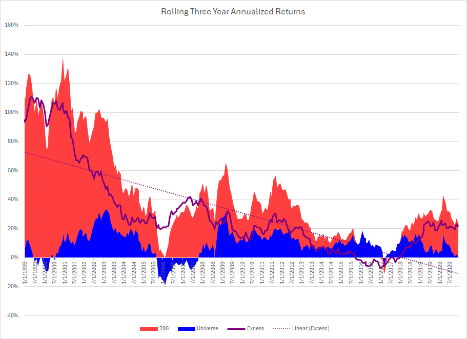
Here are rolling three year returns:

Notes:
This was a very popular public system that was designed in 2008 or so. Notice the drop off out of sample.

Notice also that the system stopped producing excess returns from 2015 - 2018.

My sense is that too much money was eventually put into this system; causing huge collective slippage. Once people stopped using it, the results bounced back to the prior out of sample period.

1 Like

I don’t have a favorite metric for ML models since selecting a metric really depends on what we want to optimize. It’s also important to know strengths and limitations of each metric. For example, R^2 is trivial to hack to be 1.0 unless regularization is applied.

In this case, I’m not sure the metric is useful except to see that there is a difference between ranking systems and even then there could be different systems but same R^2. Also, it can’t be assumed that returns grow linearly and it doesn’t tell anything about overfitting.

jvj, You are obviously well informed and I appreciate your input. I think (hope) I did not say anything much different in my last post that expanded on my uncertainty about metrics. Well said.

I would like to take this opportunity to mention to the forum a metric and a target are different. For example you could target excess returns and still be most interested in the alpha produced by your model which would be a metric in this example. I link to Marco and a member here who are discussing Alpha as a target. Alpha is a great metric. But is it a good target for an individual stock? Is next week’s predicted Alpha for a single ticker helpful or even meaningful as a target? AI Factors - ETA SOON! (beta release) - #13 by marco

Thank you for adding to this discussion. And again I am not sure I will even look at Sklearn metrics. Maybe the Alpha of the model produced (which will probably be provided by P123 in a sim of the model) would be a good metric for me to look at.

Jim

How to access this tool?

Sorry for not being very clear. I am sure P123 will be making this part of its AI/ML release due in March. I am sure this is a nice feature that P123 could expand on (or correct me if I am wrong). But if ML results are somehow made to be ranked and could be used in a sim the Alpha will be there (in the sim) as I do not think they will be removing that metric from the sims. And again a nice feature that P123 will promote at some point, I assume.

Why aren’t bucket returns organized by alpha displayed? The focus seems to be on excess compared to benchmarks or the broader universe. Shouldn’t the objective of these performance-ranking tools be to elucidate idiosyncratic returns?

I have an additional question that may be suited for @yuvaltaylor. If we’re not normalizing for volatility in the ranking system—meaning we don’t scale each stock return or bucket collectively—how can we accomplish this using the tools provided by P123? I’ve expressed disagreement with the return stream that the tool is analyzing, suggesting that we should focus on alpha adjusted for volatility instead. If P123 remains unclear about its rationale, one can simply assess the performance of a volatility rank system for and scale each bucket to the same volatility to understand empirically why this approach matters. Of course, theoretically, one must study the return of each stock independent of volatility to determine if the ranking factor is accurately predicting excess returns alone; benchmarks and universe are arbitrary. Thank you.

We’ll add Alpha in follow up release. Thanks!

I like the charts and metrics that appear after testing a ranking idea. I especially like this chart:

However, a massive improvement would be adding the ability to beta weight the H-L line. For instance, shorts generally have higher betas than longs and, to the
extent you are trying to observe some sort of long/short opportunity the ranking creates, being able to beta weight to neutral net exposure would be helpful.

Thanks