Would be interesting to see stdev. and/or slope on the periodical excess returns.
We tried many things until we settled on this time series of compounded period returns. This was the best we came up to represent the stability through time. Every other attempt just looked like a bunch of noise.
All the data needed to produce this page is in the Download. This includes stddev for each bucket rebalance that we have not used at all. We encourage you to propose your own design (a picture helps a ton) that we can incorporate in the next revision.
Thanks!
Maybe not a graphics consideration but you might want to consider this especially if your implementation of ML uses r2_score as a metric. This is the default metric for most Python models and many of your ML models are non-linear (e.g., Boosting and Random Forests): Exploring a Third Metric for Stock Ranking Systems (Sklearn's r2_score)
meh! I was disappointed with the addition of spearman. Not much more info than pearson. I don't think adding a third one would help
I just realize RS performance has changed, but the result are no clear to me. First of all there is no explanations and second one the performance return is not in line with the previous results.
Take one of my best RS here attached…the best bucket are 1 and 2 with United State (Primary) while with Universe Easy to Trade US result are in line with logical expectations.
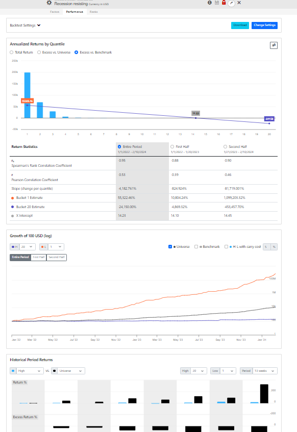
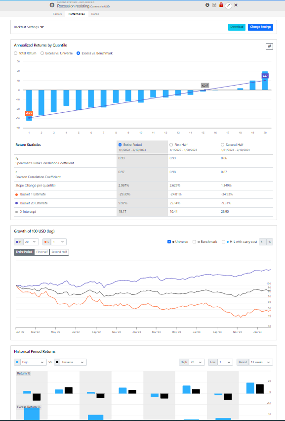
Any reason for such a difference?
I am glad that you are working on this!
My first impressions:
For charting consistency of results over time, I think that two other options are much more useful:
(a) the existing chart in rolling test results
or
(b) a relative growth chart
Also, I would look for ways to minimize clutter (such as by hiding setting options) and showing the most important stats without scrolling.
In the new version the Minimum Price defaults to 0 (it was 3 in the prev. version), which is fine with more liquid universes. With universes that include penny stocks the results are meaningless. Try setting the Minimum Price to $1 or more.
As far as the reasoning for this change: we didn’t want to set a minimum price to an arbitrary value. In addition it’s a post ranking filter which leads to unbalanced quantiles. We want the user to be aware of every nuance.
Now we just need some sort of display that highlights the problem. Let us know if you have suggestions. Try downloading the data. You should see many outliers, volatile returns, etc.
If you download the data using the universe United States (Primary) with Minimum Price set to 0 you will see that the average volatility of Bucket 1 is 10x higher than Bucket 20 due to penny stocks.
Perhaps all we need to alert you of the problem is to show a warning when the average volatilities of the H & L buckets exceeds 2x.
I wonder what this rank performance test would look like with z-score normalization of the ranking? Hmm, or even of the returns? For sure, nice to have z-score in the download data (thank you P123).
Note: you could no longer guarantee that each bucket would be the same size (for rank normalization). But instead you could construct it as a bell curve . I.e., top bucket is p-value < 0.05
Honestly I have not played with z-score much to have an opinion. But I may be downloading z-score data as early as today. Maybe others have already download the data and have an opinion on this. I do not. I just find z-score interesting and POTENTIALLY useful at this point.
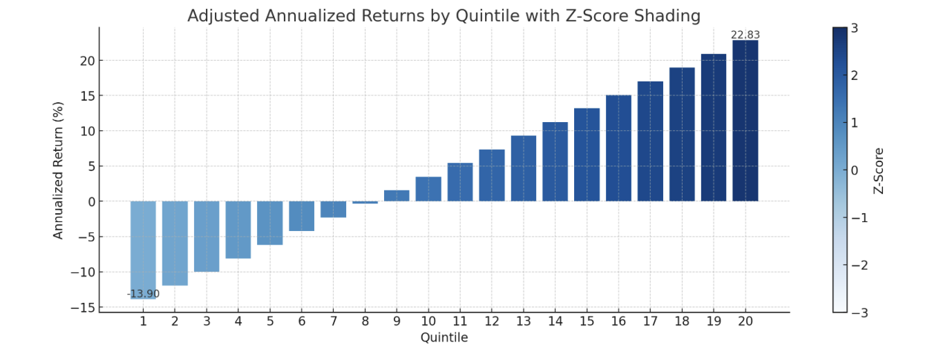
EDIT: @marco graphics recommendation. If you colored the buckets differently when the bucket’s RETURNS has a z-score (z-score normalization of the return) that gives a p-value < 0.05 (normalized to the entire data set) it would look pretty and be informative. Maybe impress a visitor or two to the site. If attractive to P123, relatively easy when you include more statistics in the next release?
Maybe shade the bar based on the Z-score of the median- or mean-value for returns of that bucket. We now have the returns but do not know their Z-score—the shading would tell us that without having to look at anything else. So it would be truly informative.
Would it be making it too for users? After all someone might do well selecting ranking system (or factors) with “a dark top bar.” And maybe a positive Spearman’s rank correlation. Or maybe a slope recommendation cutoff from the forum for advanced users? No statistics knowledge whatsoever required to do well at P123? Hmmmm…yep, too easy but maybe marketable.
I would also consider being able to toggle on or off 95% confidence intervals (or even 99%) for the bars. If the lower bar is above the returns for the universe it suggests statistical significance. Or above zero for excess returns. Again, easier than anyone (including me) deserves. For example this rule might do well: “I will select ranking systems or features with dark top bars where the inferior 99% confidence interval bar is above the benchmark and the Spearman’s Rank correlation is positive,”
So purely an idea that may or may not use useful. I am suggesting (for consideration) shading the BARS and have a legend for theZ-score of the normalized returns. Akin to what ChatGPT did with my idea:
Were you planning on using color saturation (or hues) of the bars to carry other information to make it, in essence, a 3-dimensional graphic?
Ok Marco tanks, with minimum price set to >1 $ things are better.
I downloaded the data, I understand every row is a week, and no more else. I grasp the meaning of every column (return, std dev,turnover, n. of stocks) for the various quantile, but frankly I do not understand the meaning of them…what’s the added value I can squeeze from them?
RS I think is the clue of PF123 and I think something more friendly would help. PF123 is improving continuously, but it is even getting more complicated and that I think this goes opposite the way to improve the stalls of new incomers, and finally your business.
[rank_perf (1).csv|attachment](upload://3lslcct70P3ioGCBsckXOX, 37ERy.csv) (242.2 KB)
Thanks for the feedback. I agree, but the old version was hiding too many potential issues. We need to work harder to make the tool to do the best thing possible "out-of-box", and not expect the user to do all sorts of backflips to figure out if the results are meaningful.
We need something better that just price
Just having the default "price > 3" (post rank) was a simple, quick hack. The "3" was the smallest number that seemed to produce stable results, but it was not researched in any depth:
- it can produce unbalanced buckets
- in Europe we have currency issues
- in Canada & Europe stocks generally trade at lower prices
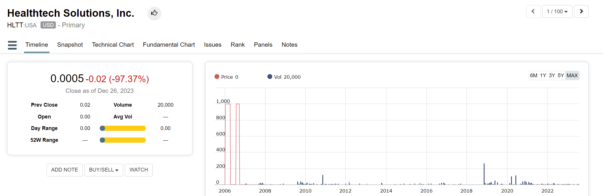
And check HLTT below. In 2006 the price data was jumping around between $2.20 and $1000. So with a "price > 2" you'd still have major issues. (sure it's bad data and we should report it, but there are many, many examples like this)
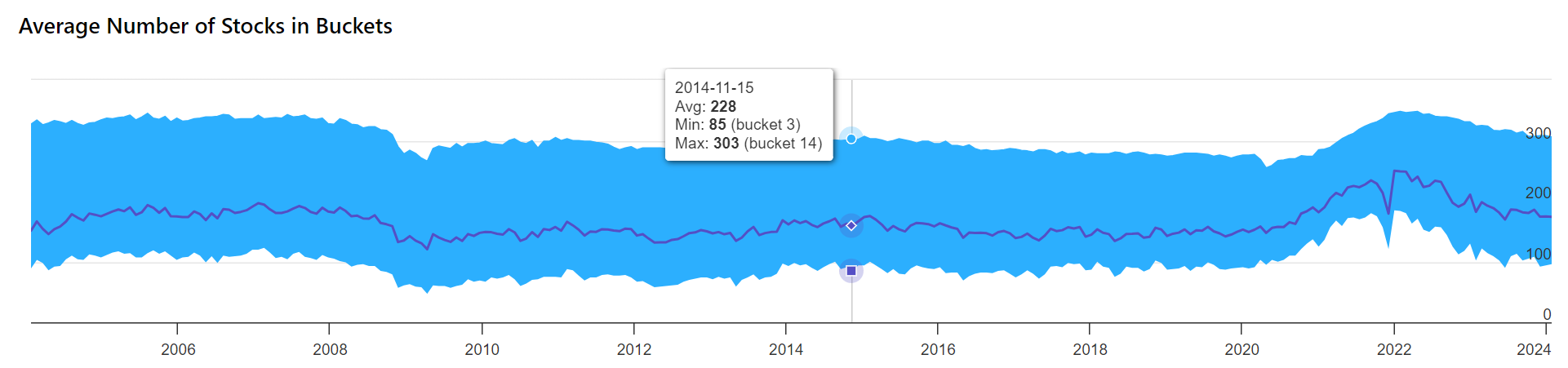
With a price filter > 2 here's what happens to the number of stocks in the buckets. The average is ~230 but some buckets have 85, others 300+. It's probably ok since 85 stocks is still a good number; but at what point is this volatility not ok?
Follow the money
Probably the simplest and robust solution is to create a new filter that combines price and volume, and default it to eliminate stocks that trade less than $50,000 daily. It would still be a post-ranking filter, so we'll need some sort of warning when the number of stocks in each bucket is too unbalanced.
Let us know you thoughts.
NOTE: this is a very timely discussion for our AI/ML project. In ML the weights are being altered by the algorithms, so data cleansing is paramount.
Is there any plans to add the additional Return Statistics to the Optimizer as well? ![]()
We were just discussing the optimizer. The plan is to incorporate the optimizer as an additional tab of the ranking system (instead of a separate tool, how silly who did that!), and add major statistics/charts for entire period and the two halves.
Is that all you’d need? Not sure much more is needed. The first test should always be a single rank performance backtest to catch major issues. The optimizer is for adjusting weights.
Well, the ranking system does have an optimizer. It’s just too hard to use. I’m looking forward to see the changes.
EDIT: Ok, I see now. P123 wants to increase rank optimizer visibility/accessibility. Hope functionality is improved, too.
That would be great to integrate the rank optimizer as an additional tab. Currently it’s a bit of pain to use because when you copy a ranking system to the optimizer, you still have to update your settings on the optimizer one-by-one (rebalance frequency, universe, number of buckets, etc) which is tedious and error prone. I always want to use the same settings I just tested the ranking system on.
My most common use case for the rank optimizer is to test each node in the ranking system individually, so I generate an identity matrix of size N and copy and paste it to the optimizer. It would be handy if you could click a button to populate the identity matrix for you.
1 Like
I just started to test a bunch of individual nodes to get the Spearman and Pearson correlation Coefficient stats, but realized how time consuming that is. The optimizer would have been prefect to scan for those stats. ![]()
While I appreciate attempts to improve on the originals (which I like better visually),I second the minimize clutter bit. Not a big fan of imaginary lines everywhere being suddenly forced in. Would like the option to remove the new lines from the graphs if we have lost all access to the normal/prior ones. I for one already miss that aesthetic
We tried many things until we settled on this time series of compounded period returns. This was the best we came up to represent the stability through time. Every other attempt just looked like a bunch of noise.
You can do a lot better than that!
For example, here is a relative growth chart (which was popularized by John Bogle, the former CEO of Vanguard). Doesn’t this show a lot more information in an easy to follow manner?

Do you see how clearly it plots the excess returns over time, including the volatility of the excess returns and the turning points of the trends?
This type of plot would be very useful throughout the site, including the ranking system backtest, when comparing a time-series to a benchmark.
EDIT: I tried uploading the spreadsheet that created this chart but the format is not supported. Is there a way to upload a spreadsheet?
EDIT 2: It’s important to annotate on the chart the date of system creation and updates.
This would give you an easy way to show from out of sample results how much the system was overfitted.

Would be useful I think to be able to toggle this line on or off (permanently based on customer preferences). In my opinion it would make the graphs look a lot better. I think my initial reaction against this new look was probably due to this specific line.
Hard to say this is better than what we have. Wouldn’t ours be just as telling? I’d have to see the same data shown in different ways to tell for sure.